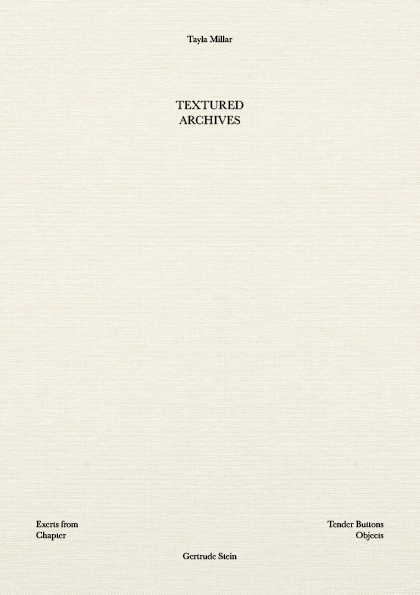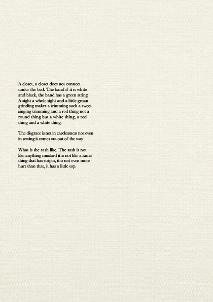
Textured Archives is breaking down and reconstructing the content of Gertrude Stein’s Tender Buttons first chapter ‘Objects’, into the structure of a wardrobe. The publication will be designed as single sheet artefacts, creating a collection of anecdotal descriptions that leaves its meaning and all understanding completely up to the user. My publication will be expressing the layered ambiguity of the content through creating connections and conceptual links between the highly interpretive metaphorical speech and the uniqueness to ones structure of their clothes and lifestyle. Showcasing the brief of ‘putting things in order’.
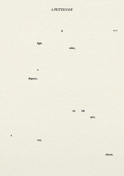
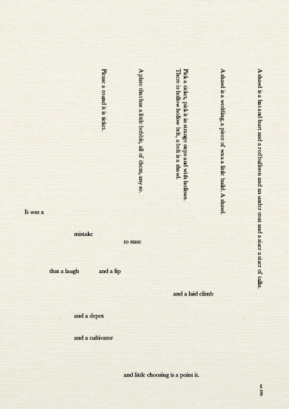
As the publication is single sheets the page navigation and order system is interchangeable. Original order is in ascending word count, located in the margins. Beginning passages consisting of scattered words moving through to the larger bodies of text. The original order can be disrupted and reordered to suit the readers understanding. The unique change in order would alter the audience experience.
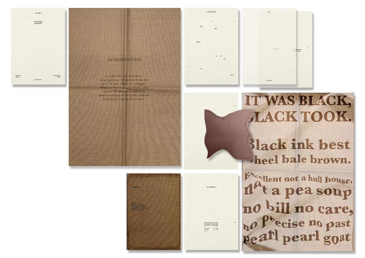
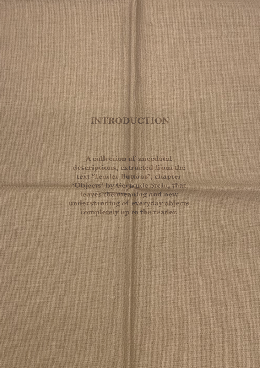
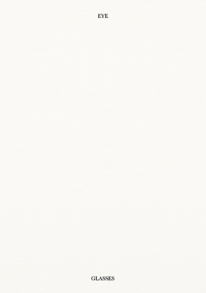
The beginning few pages include the cover and introduction on an A3 fabric fold out, followed by the smaller passages within the publication. Page eye glasses is printed on transparent stock to see through to the content.
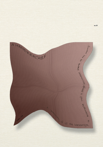
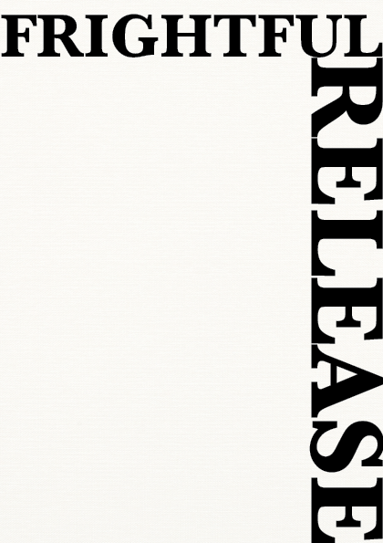
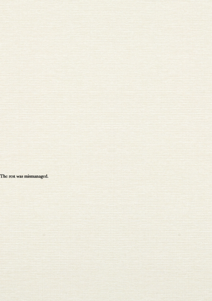
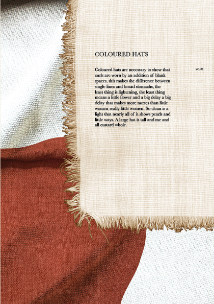
Hand stitching elements are then introduced with more fabric fold outs. Playing with the juxtaposition of scale and minimal space. A frightful release is also printed on transparent stock to overlay the passage but creating a final page with the last line, the rest was mismanaged.
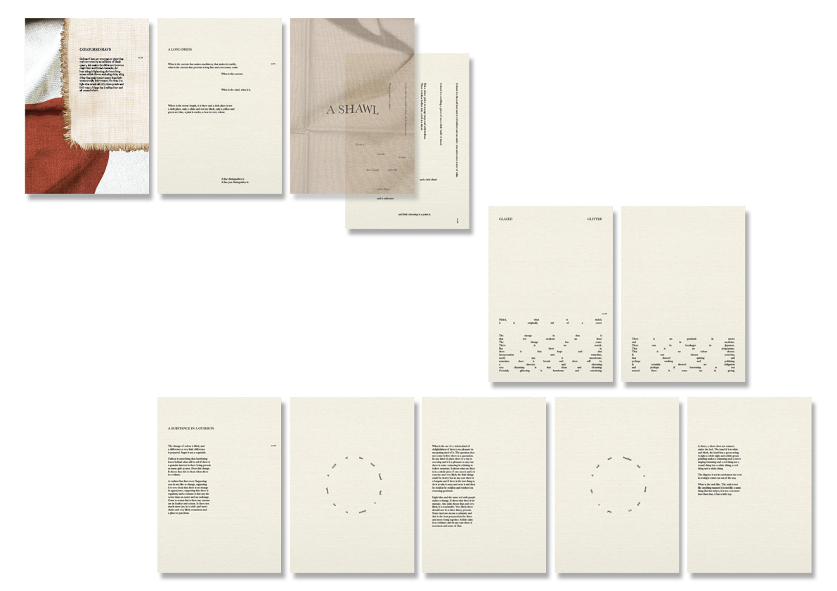
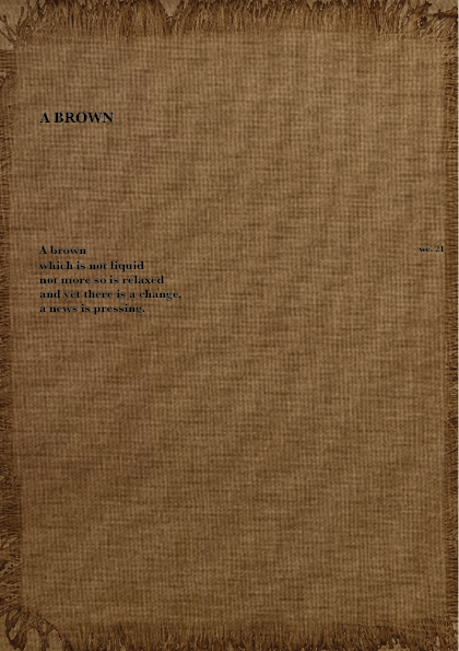
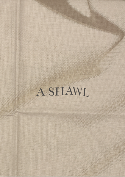
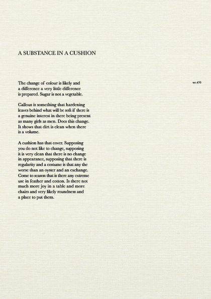
Final pages show a layered approach to the materials, including a sheer overlay page for passage a shawl. The final exert called a substance of a cushion is the largest bodied text with 470 words. To break up the dense reading the pulled lines are intentionally creating a graphic break in the text.
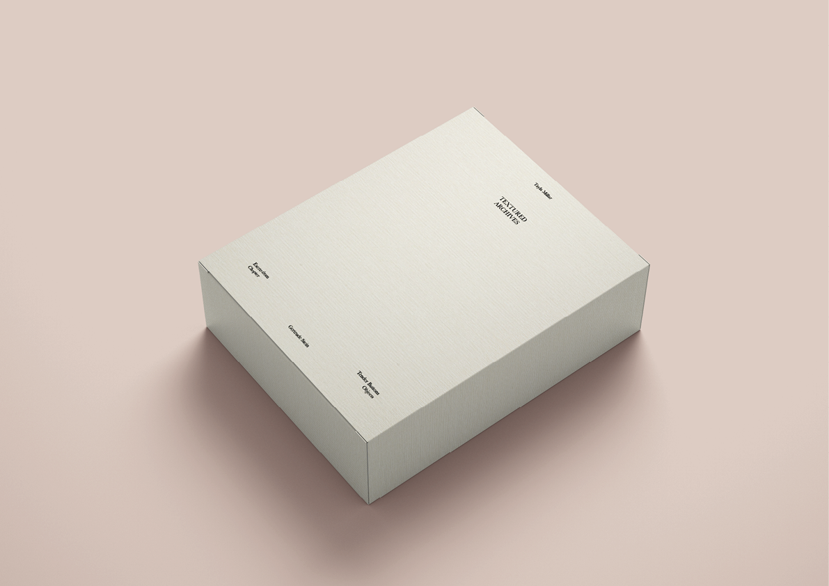
The publication will be presented in a box, with the cover being the lid. As the pages are interchangeable I wanted the cover to be permanently fixed as the first reading, hence it is built as the casing. Moving on I will now show how the pages can be reordered through different forms, all indicative of what a specific reader might do.
Below I will be presenting the pages in a new ordering system, to showcase the concept of putting things in order.
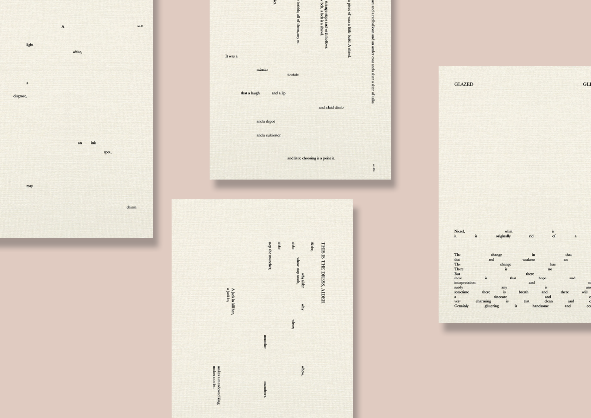
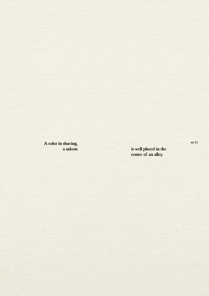
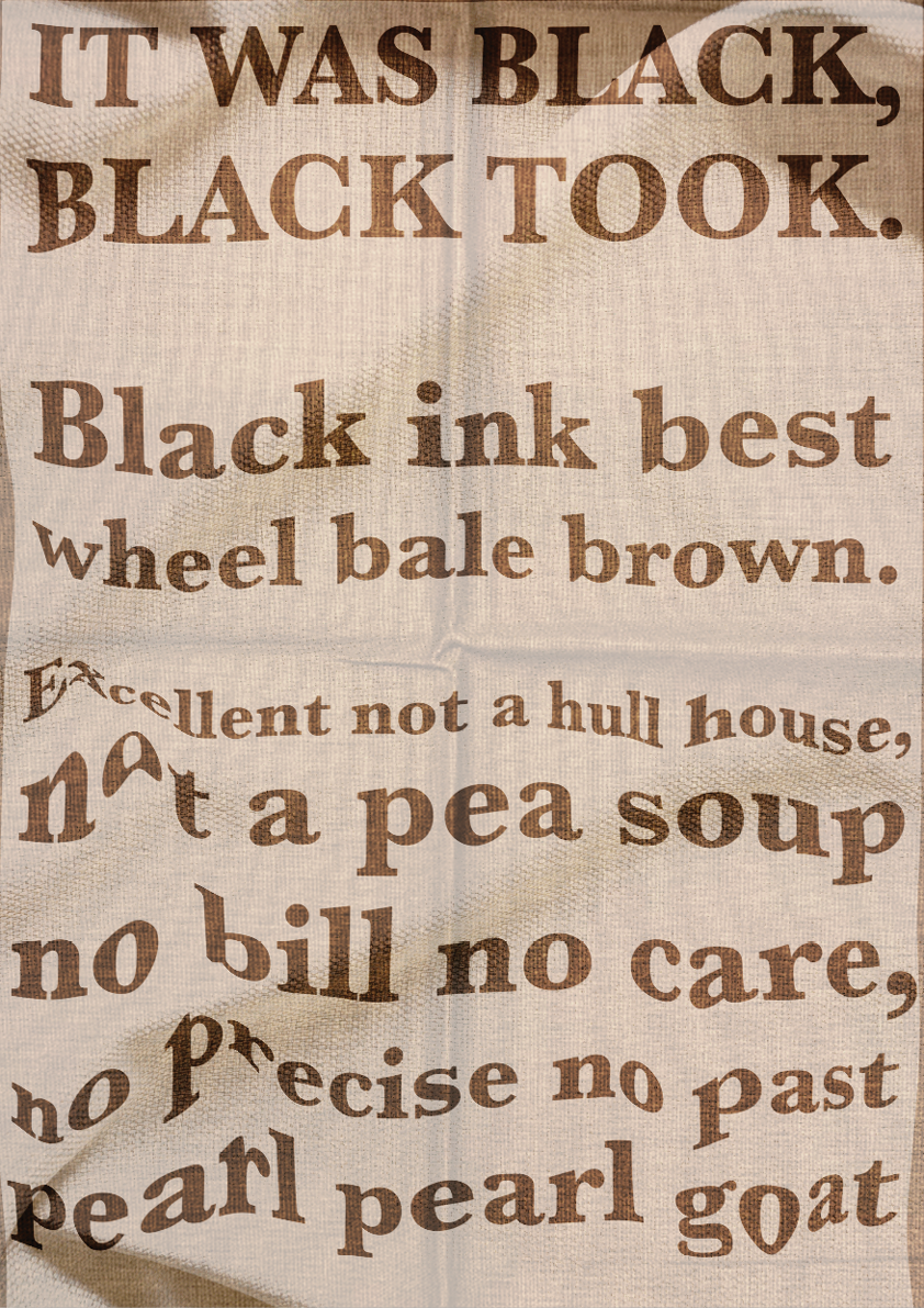
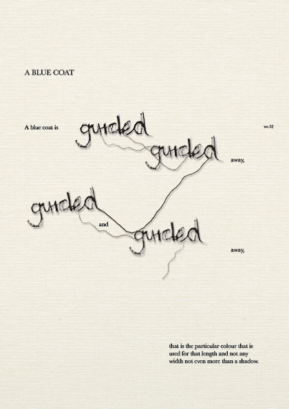
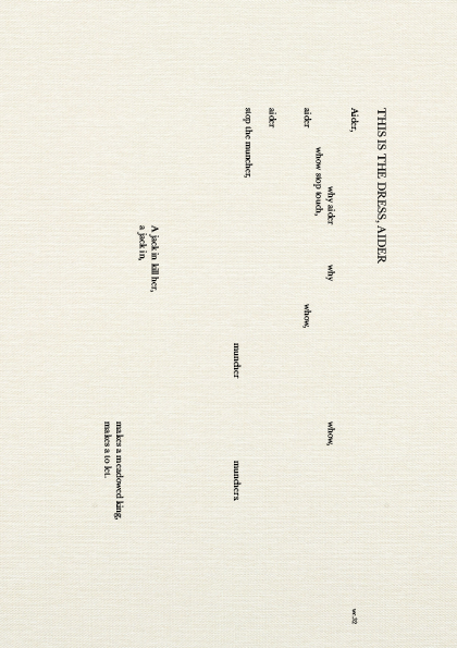
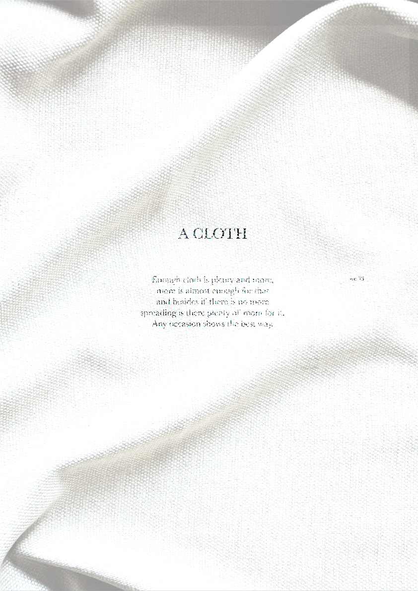
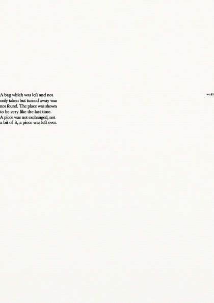
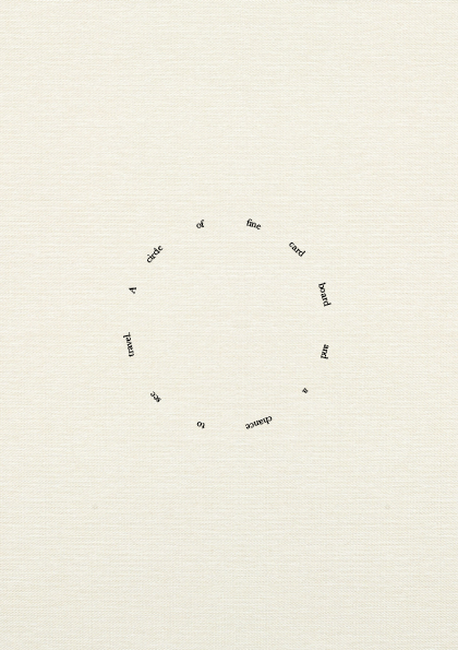
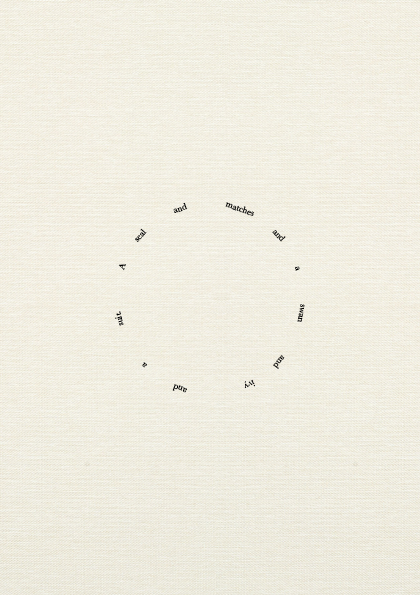
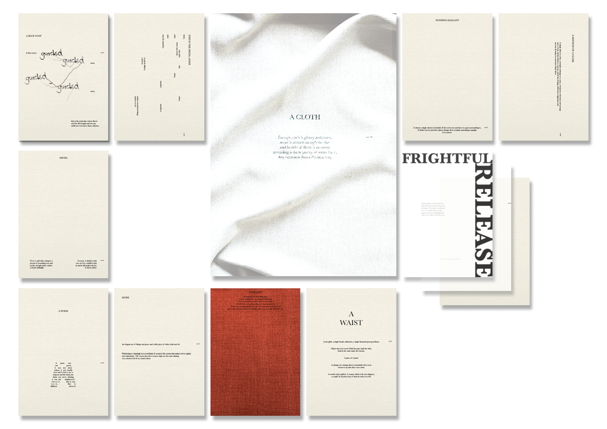
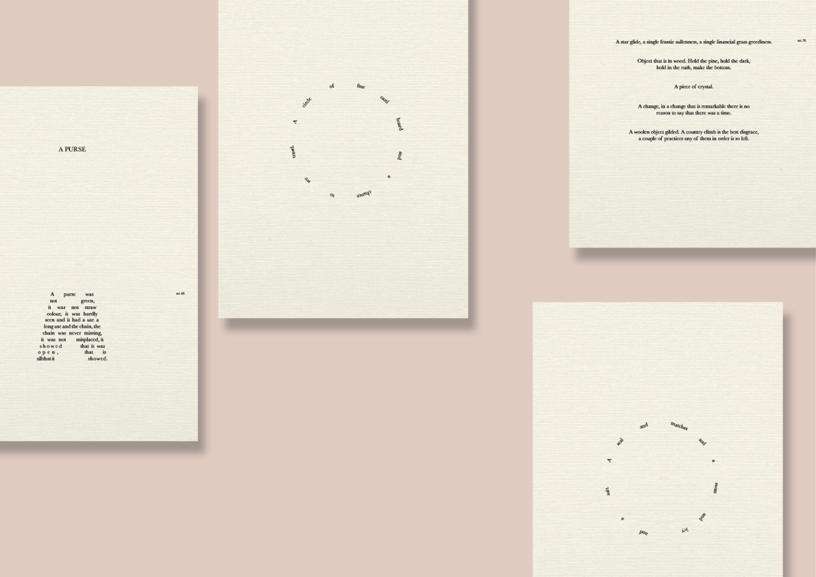
These pages are a combination of scattered words and lettering. These pages hold the same typographic approach but span from the least words to the second most largest.
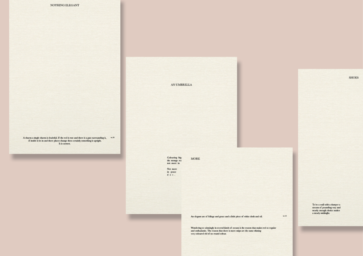
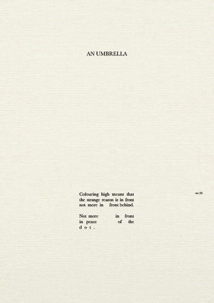
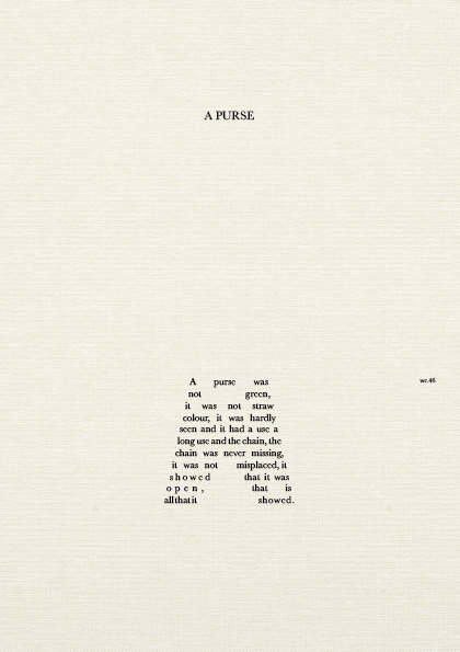
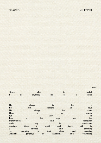
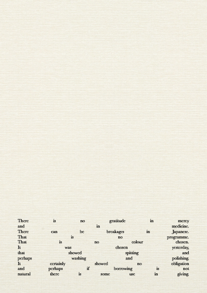
The passages here emphasise the matter of space, highlighting the minimal and clean idea of words and sentence making, the aim of its content, tender buttons.
These sets are reordered to see the different shapes created through the publication. With grouping these subtle graphic elements the dynamic nature of the text is clearly presented.
Photo Gallery