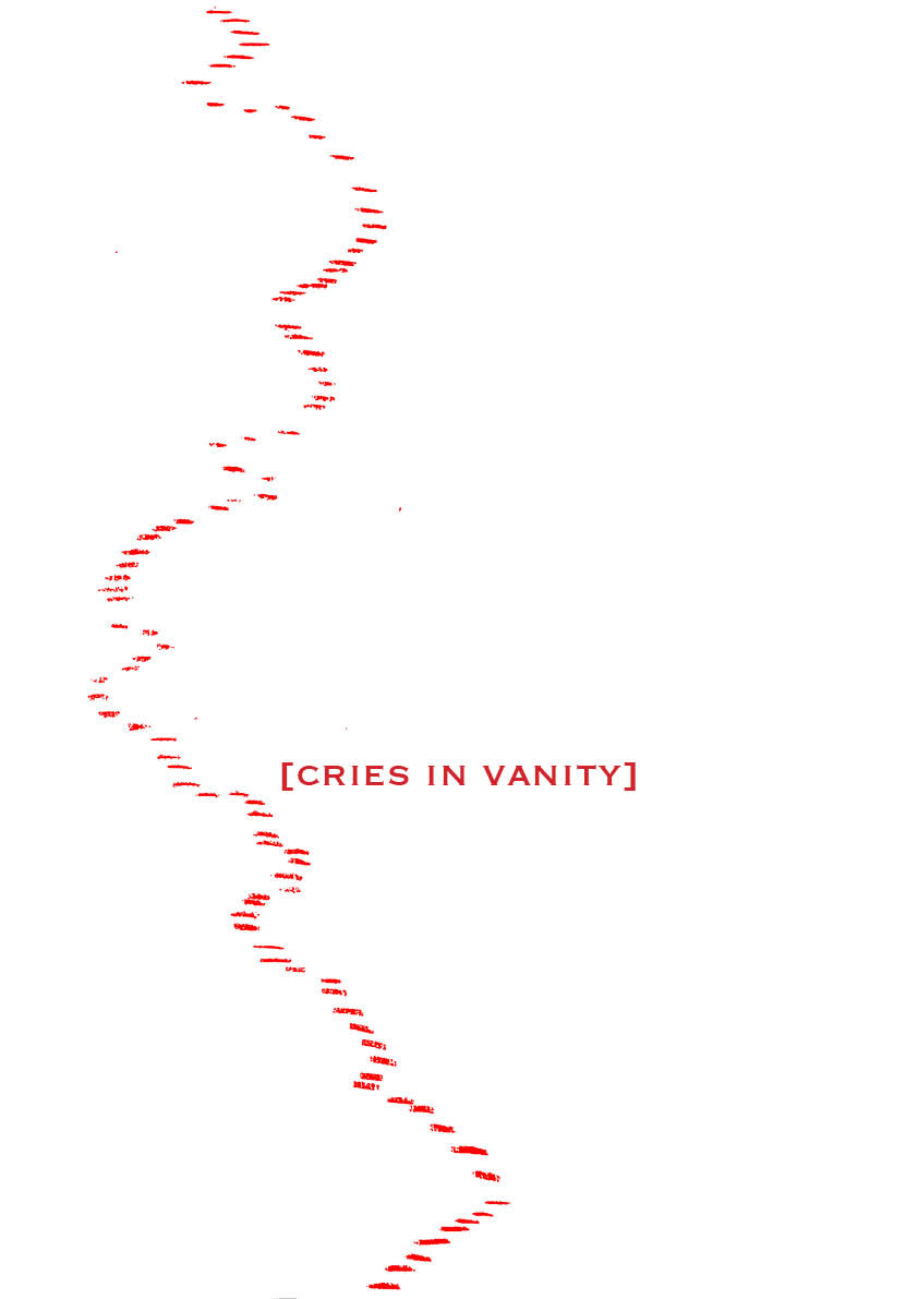
VANITY
Excessive pride in or admiration of one’s own appearance or achievements.
The quality of being worthless or futile.
The very juxtaposition of these definitions under the same title is the purest form of what my final project represents.
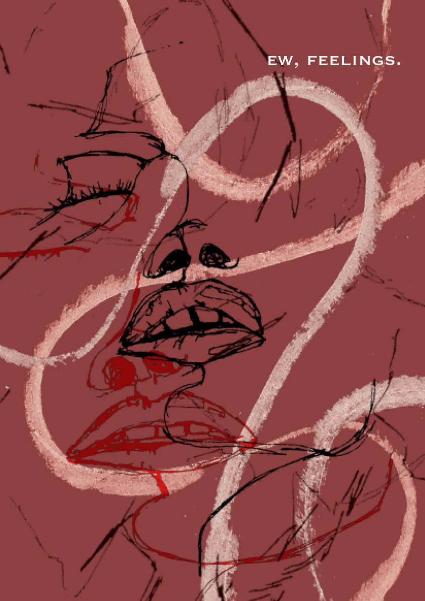
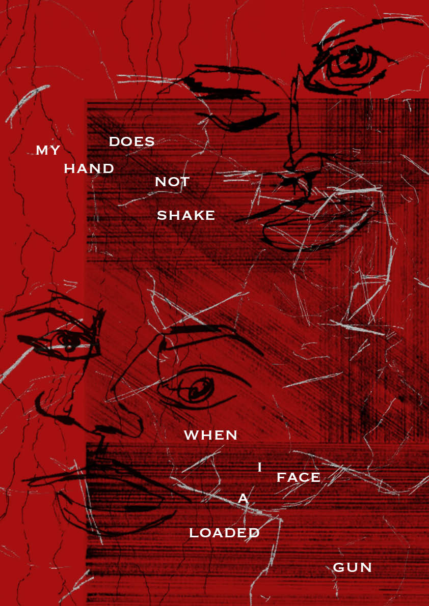
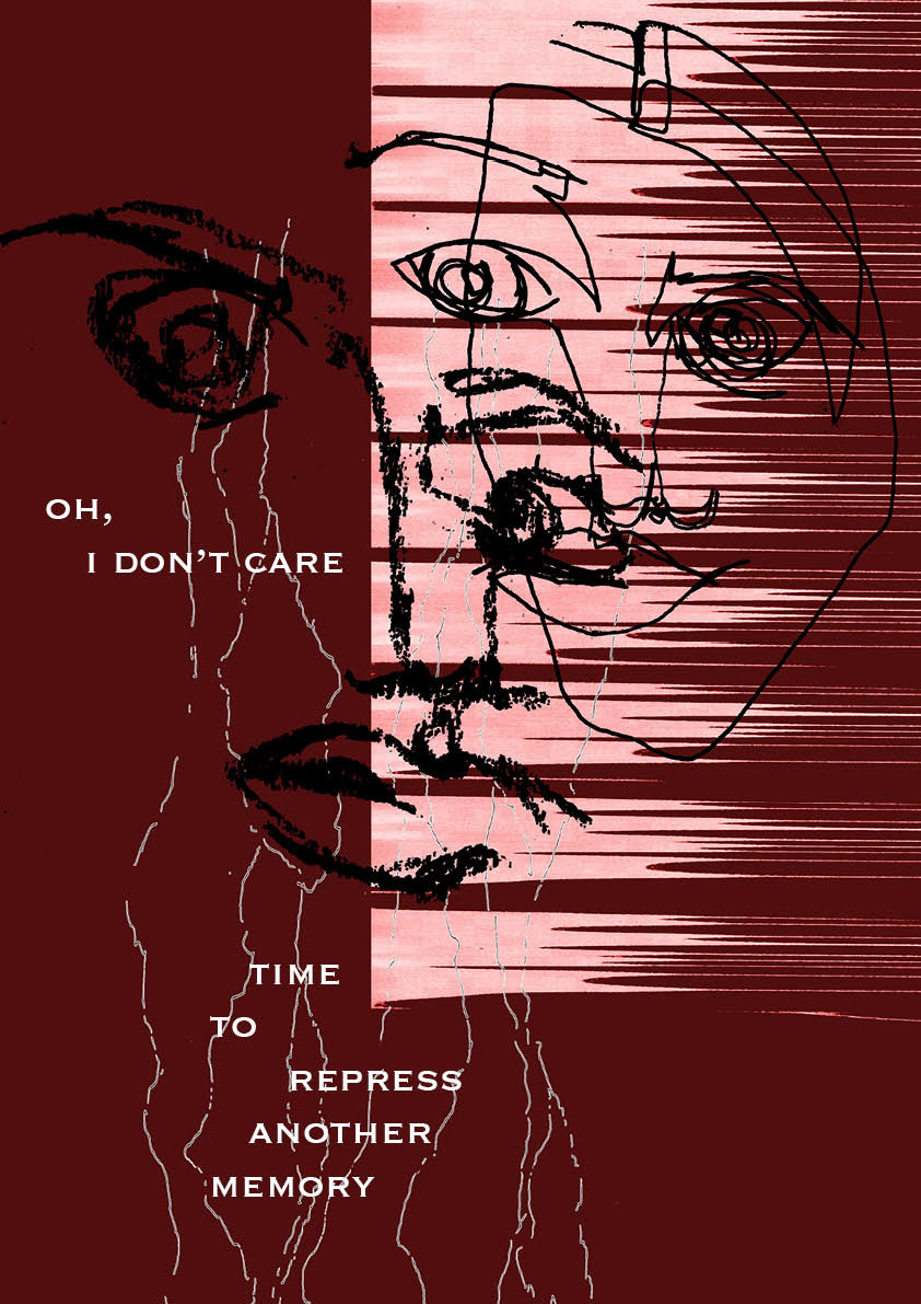
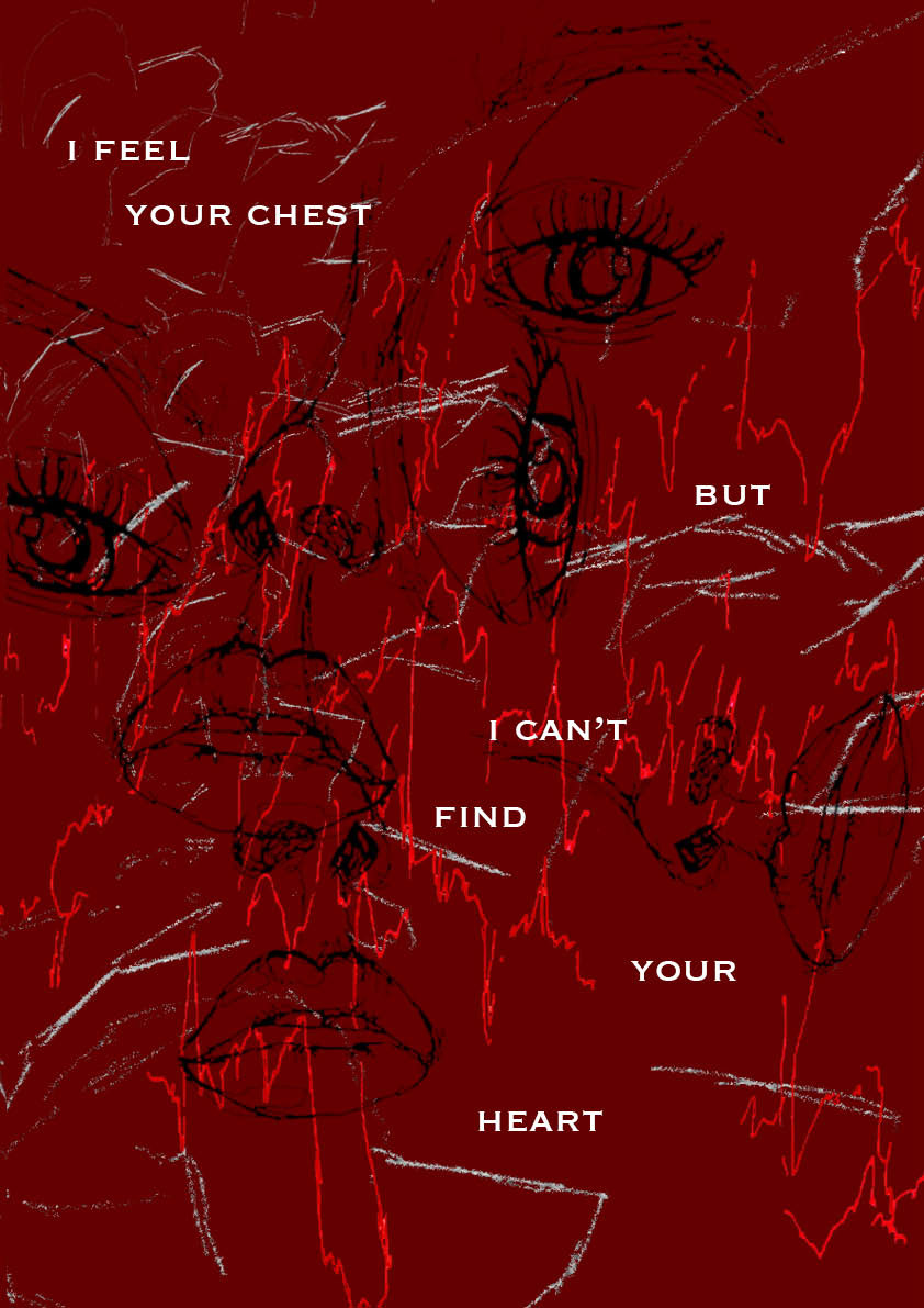
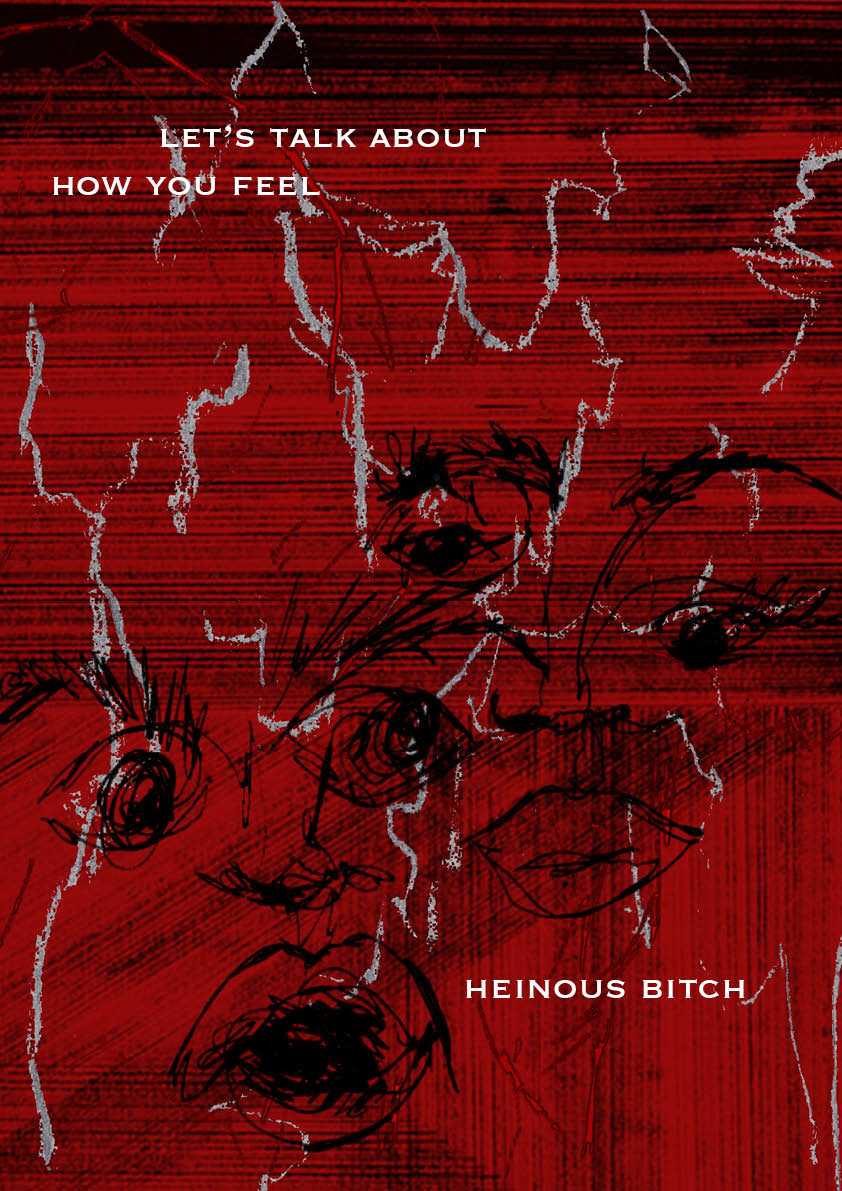
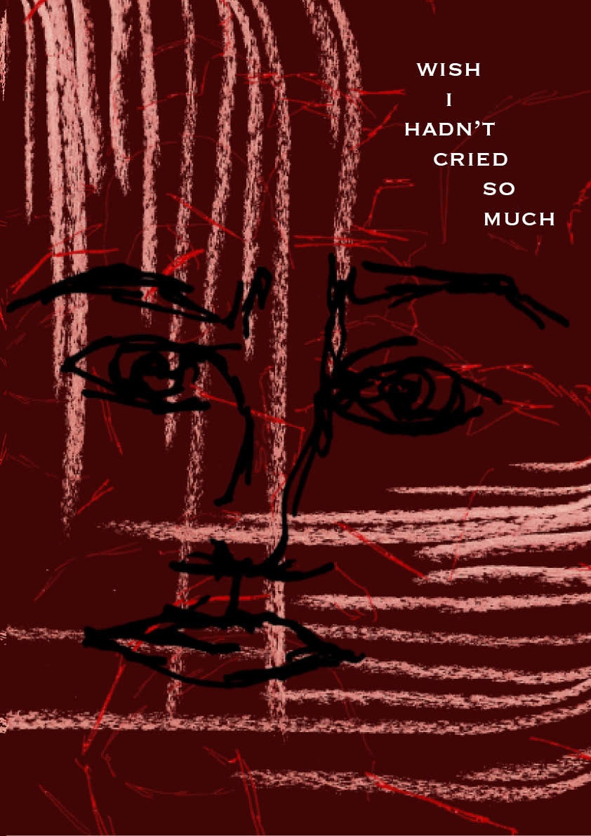
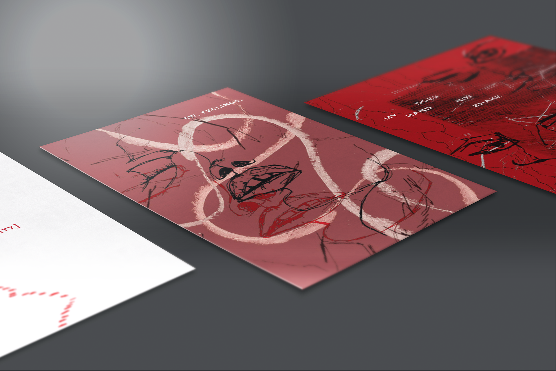
Through the deconstructed style of a modern zine, I aim to accentuate heightened ideals of emotion and vulnerability. After exercises and experimentation I was able to layer elements to make each card highly custom and personal to my own aesthetic. The most confronting emotion is revealing vulnerability, overfilling with emotion is rare as it is normally covered by the on going everyday life. Masking of emotion is exhausting, meaning that there is a breaking point, and when that reaches there is an explosion of emotions.
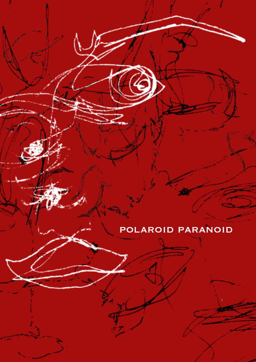
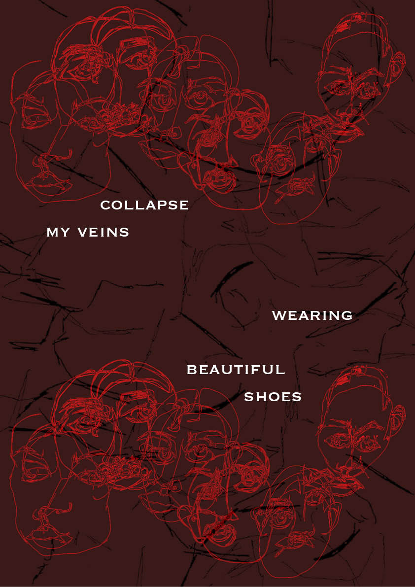
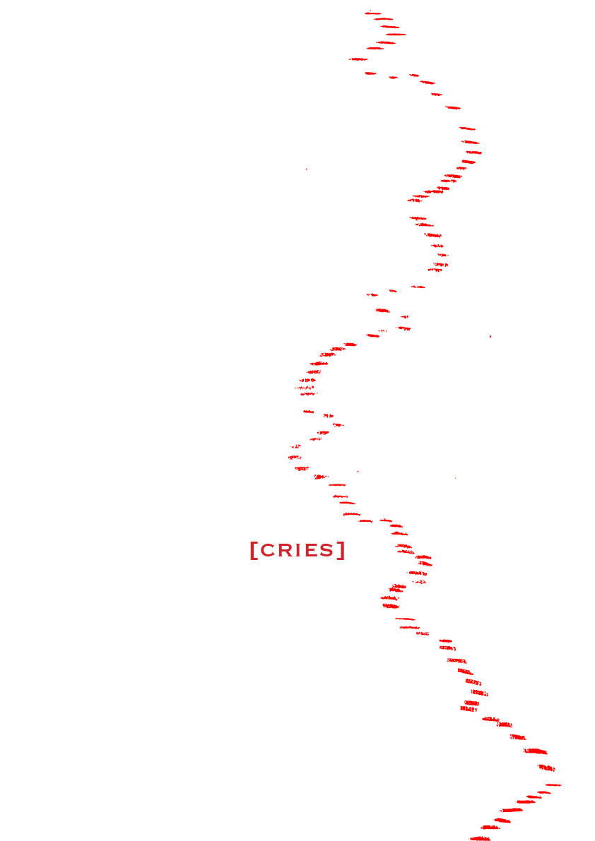
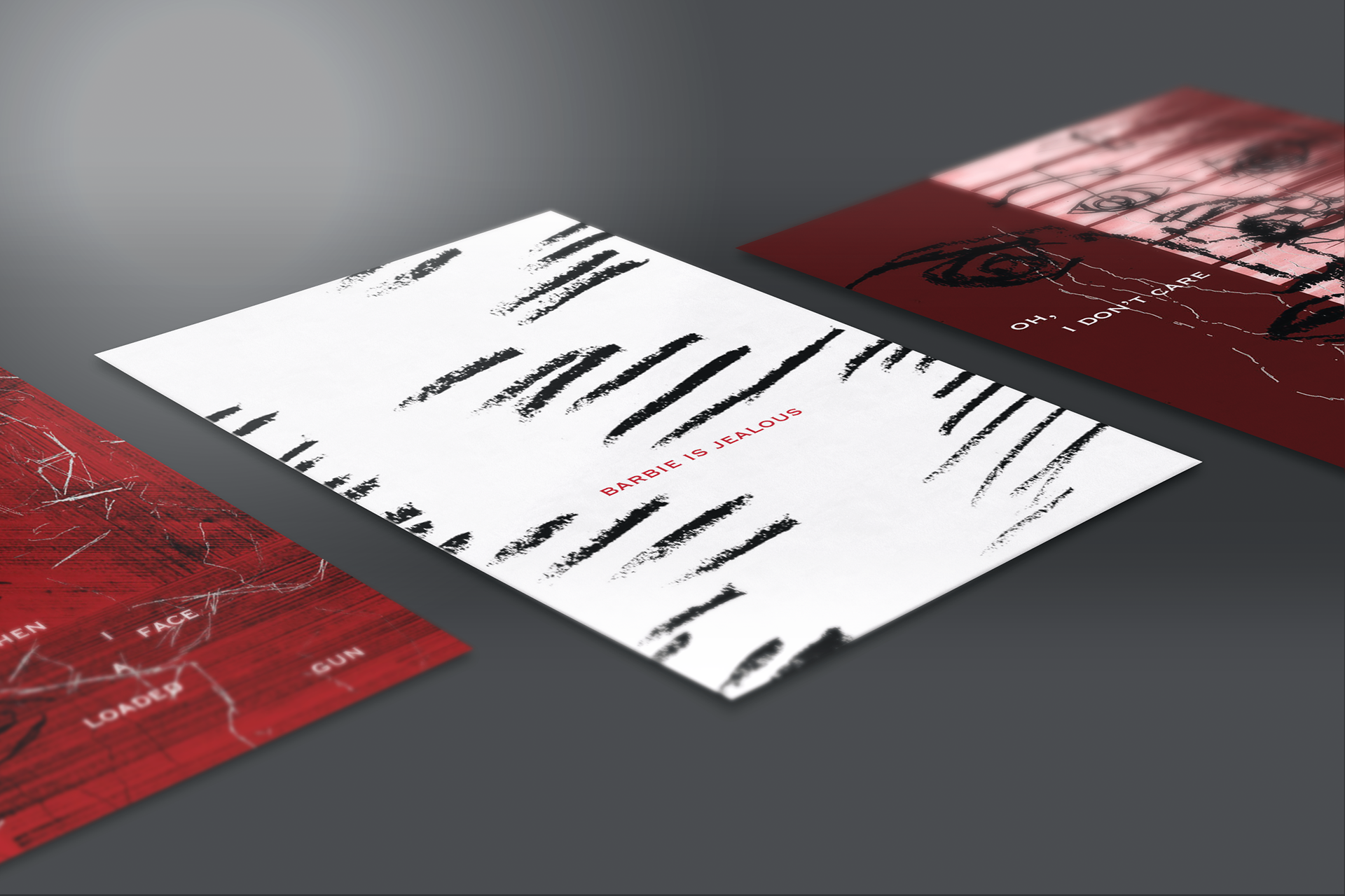
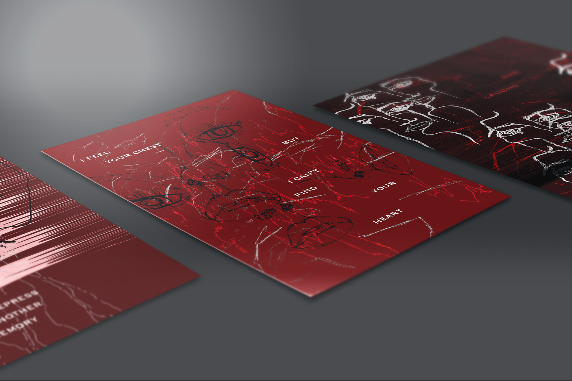
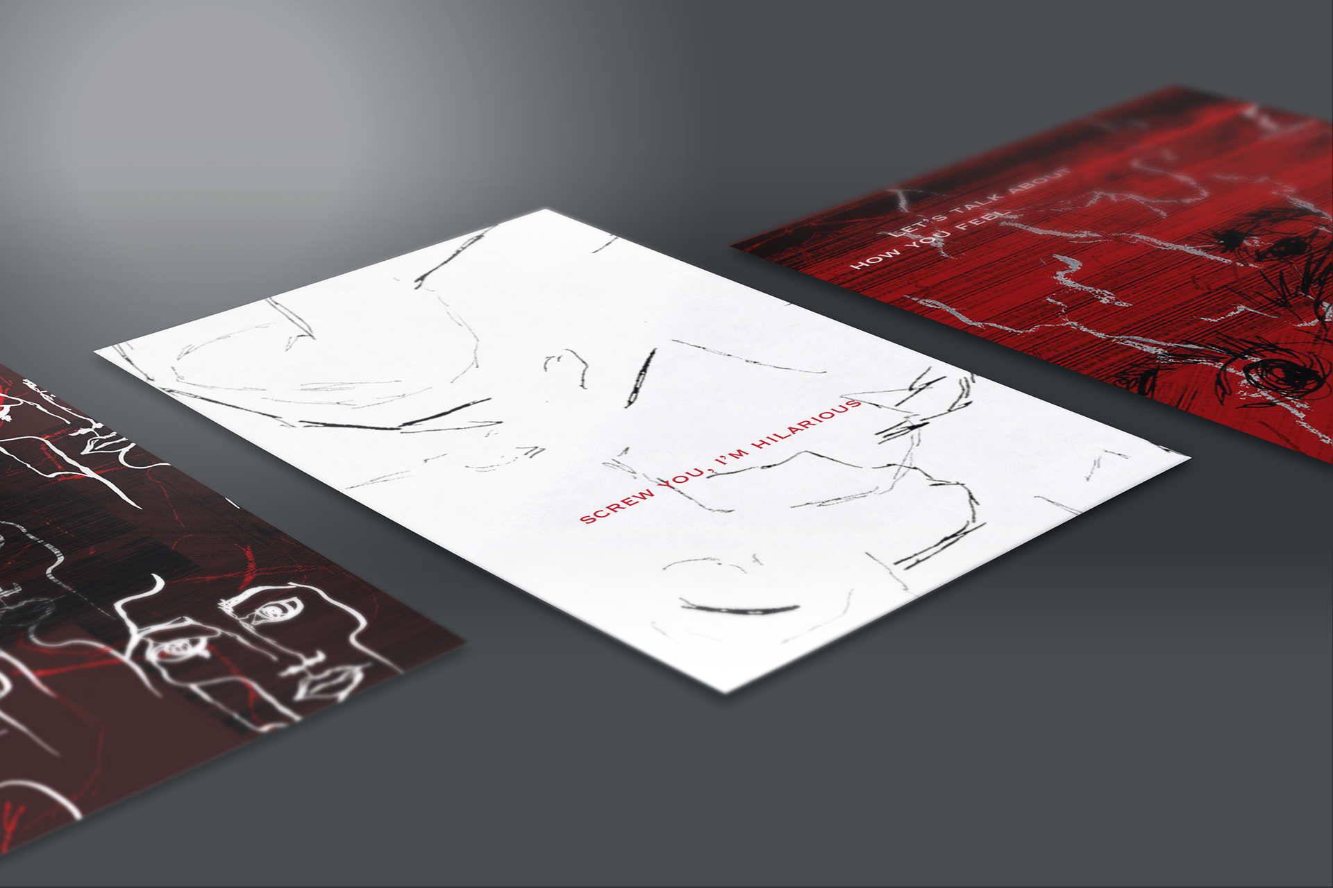
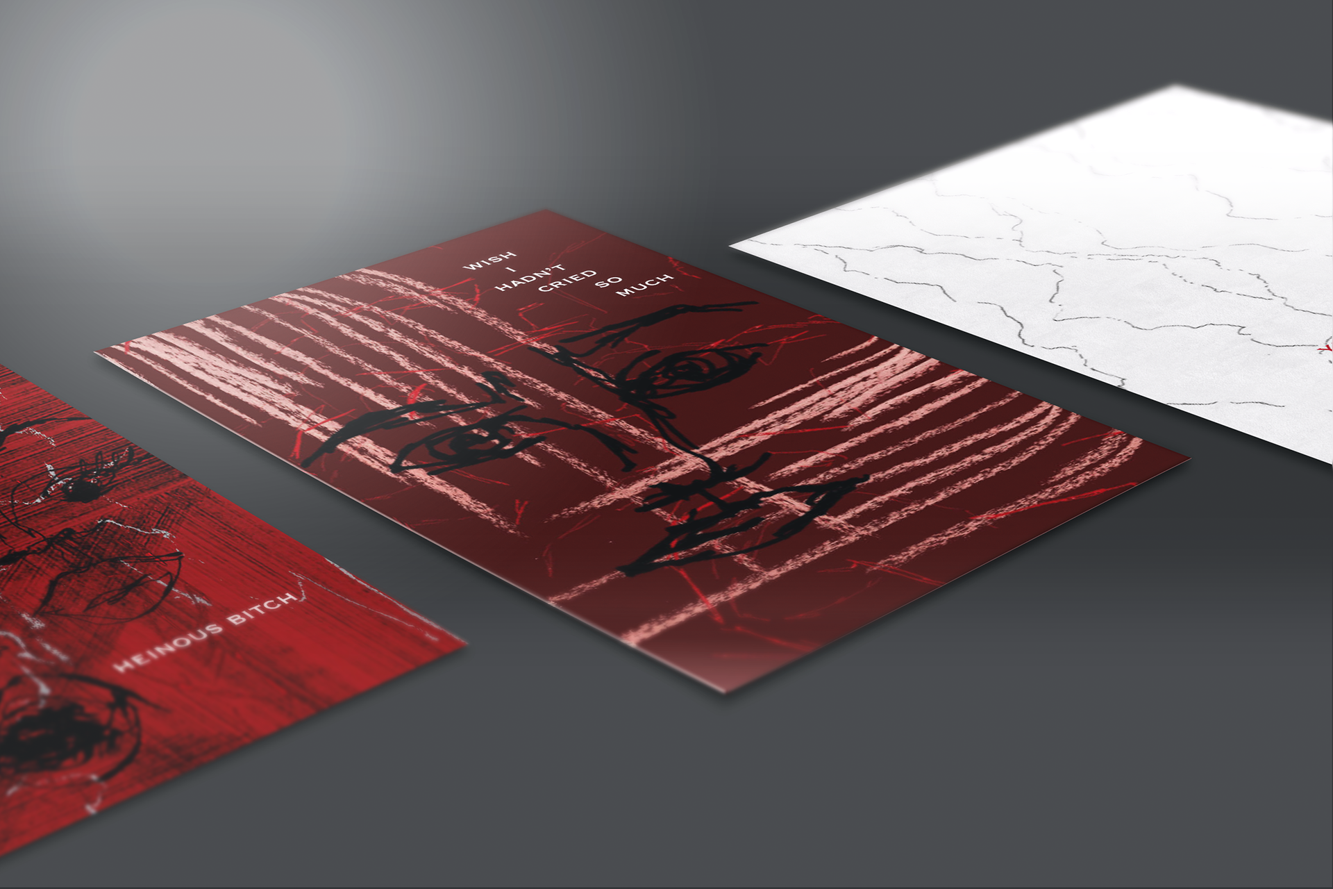
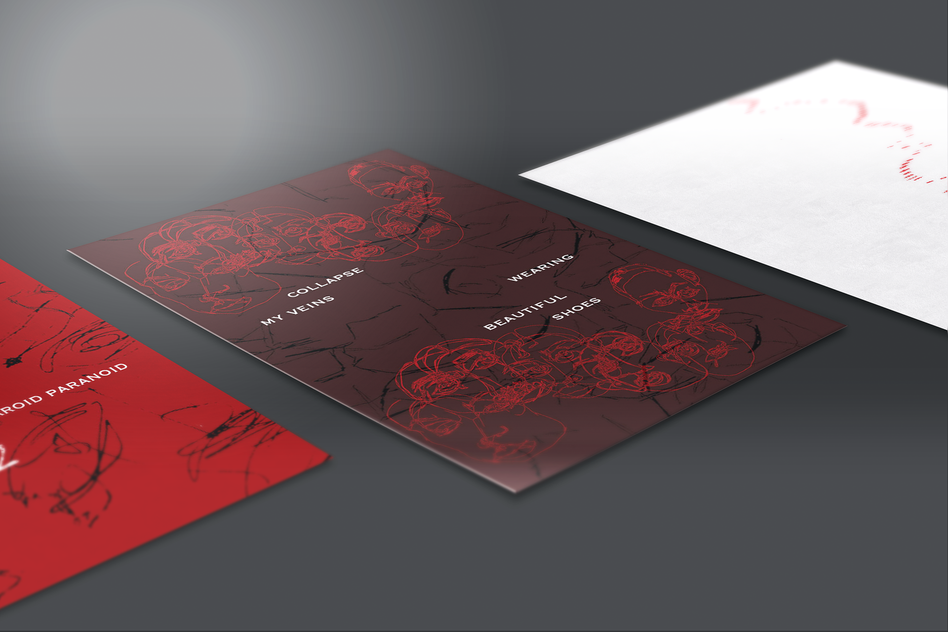
It’s easy to distract ones self with materialistic things and narcissistic personalities. I aim to present these conflicting forces with the absence and cluttering of layers and colours. Using black and white as the basic levels of emotion and red as the striking powers of trauma and suffering.
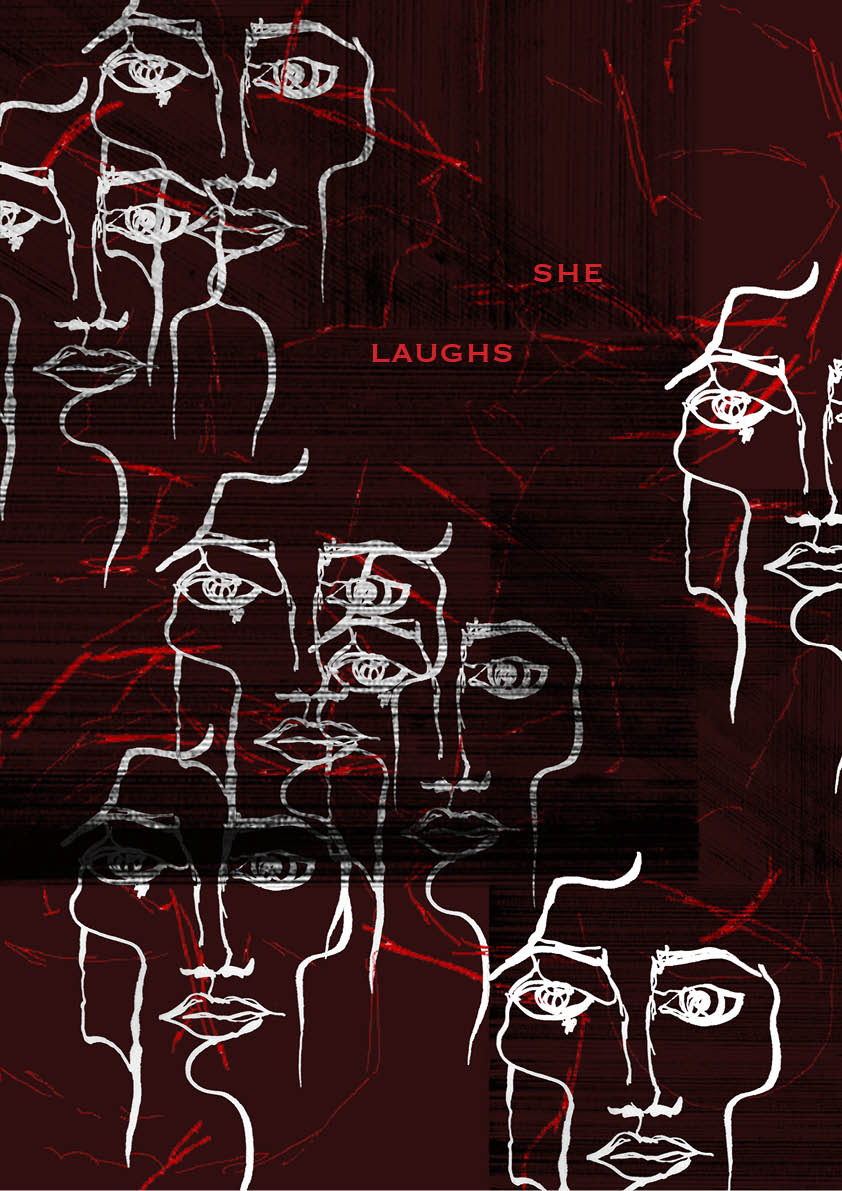
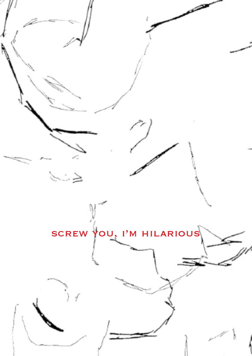
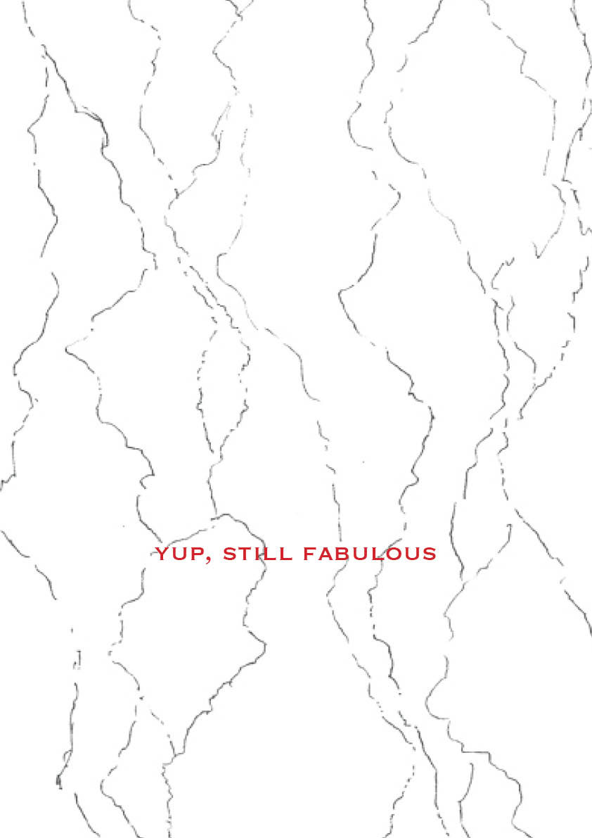
The presented zine can be viewed as a whole but I also wanted each card to be able to be understood individually. Each card with its own story, faces and textures to accompany it. But the narrative across all pages is important and can be interpreted personally by every viewer and can relate in multiple ways depending on their own experience. The sequencing of pages is also relevant to the narrative, as some pages relate directly to others, for example, the page exclaiming ‘screw you I'm hilarious’ directly follows the card stating ‘she laughs’ with a collective of serious faces.
I think everyone can cover their emotions and mask feelings daily. But I find that when simply asked if someone is okay, there is an instant breakdown and floods of emotion, an explosive trigger. External guards to avoid this such as vanity and beauty makes experiences emotionless. Fake ideals and goals of beauty creates false sense of security and unstable emotions.
This zine is an extension of Phase Four, being that the layers and concept are further emphasised. Each card is personally customised by colour and drawn texture. These background textures have all been derived from the early weeks exercises, which proved instinctual and highly emotive. Conflicting ideals of vanity and vulnerability are represented through the battle of blank and cluttered pages. The textures on each page also references as a security blanket, wrapping around the paper stock, mirrored on the back.
Considering the presentation of my work I wanted to challenge normal zine conventions and decided to deconstruct the zine into individual pages. All pages are small in size as I wanted the cards to be easily portable and kept neatly, so A5 size was ideal. The cards are 280gsm resulting in strong and durable paper stock, meaning the project will not be destroyed as quickly. I also printed on textured paper stock to accentuate the layers and form on each page, this also adds another dimension to my zine. The choice of texture was also relevant as I chose netting texture, which reflects the entrapment of emotions that is paralysed on the pages.
GALLERY