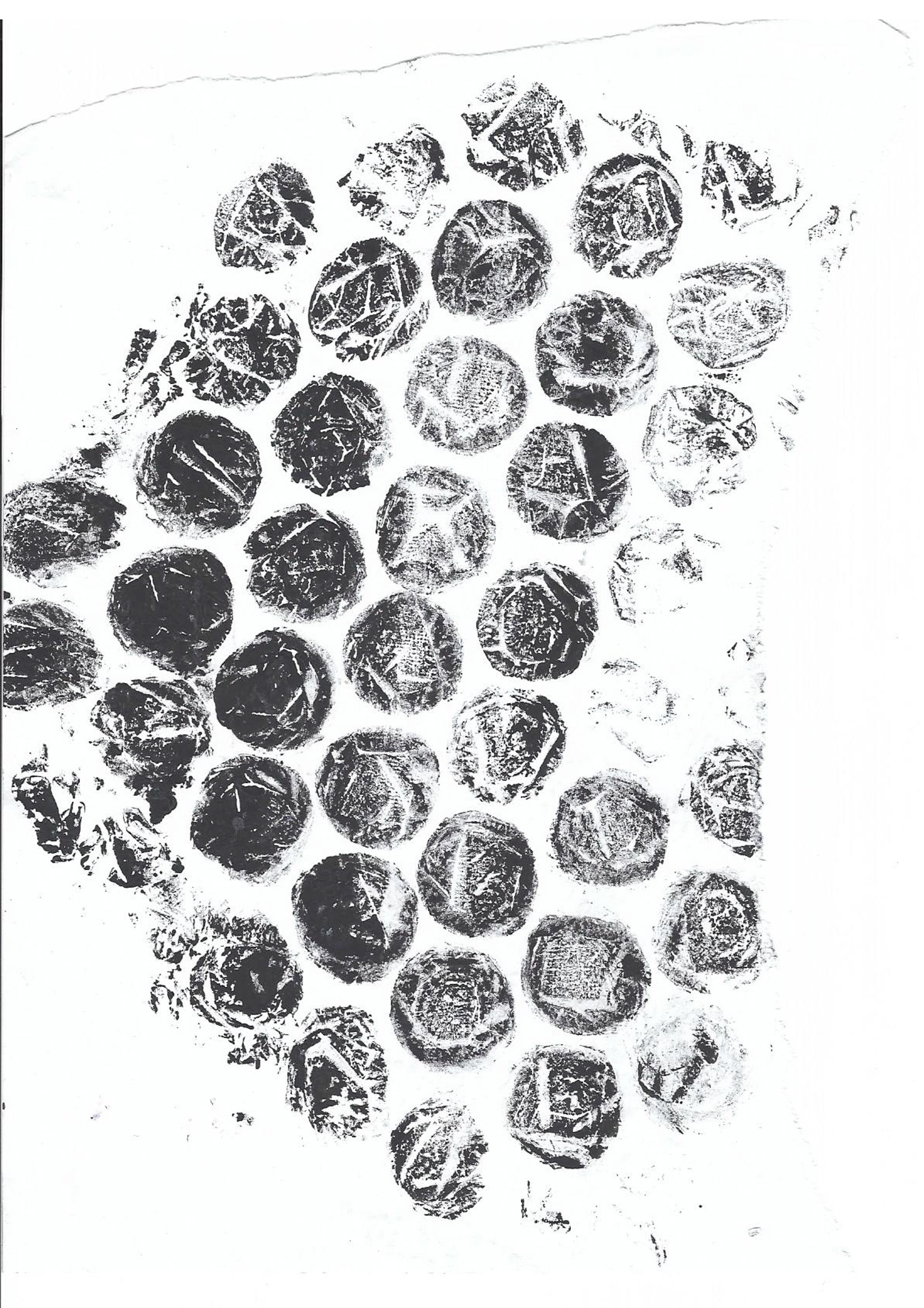
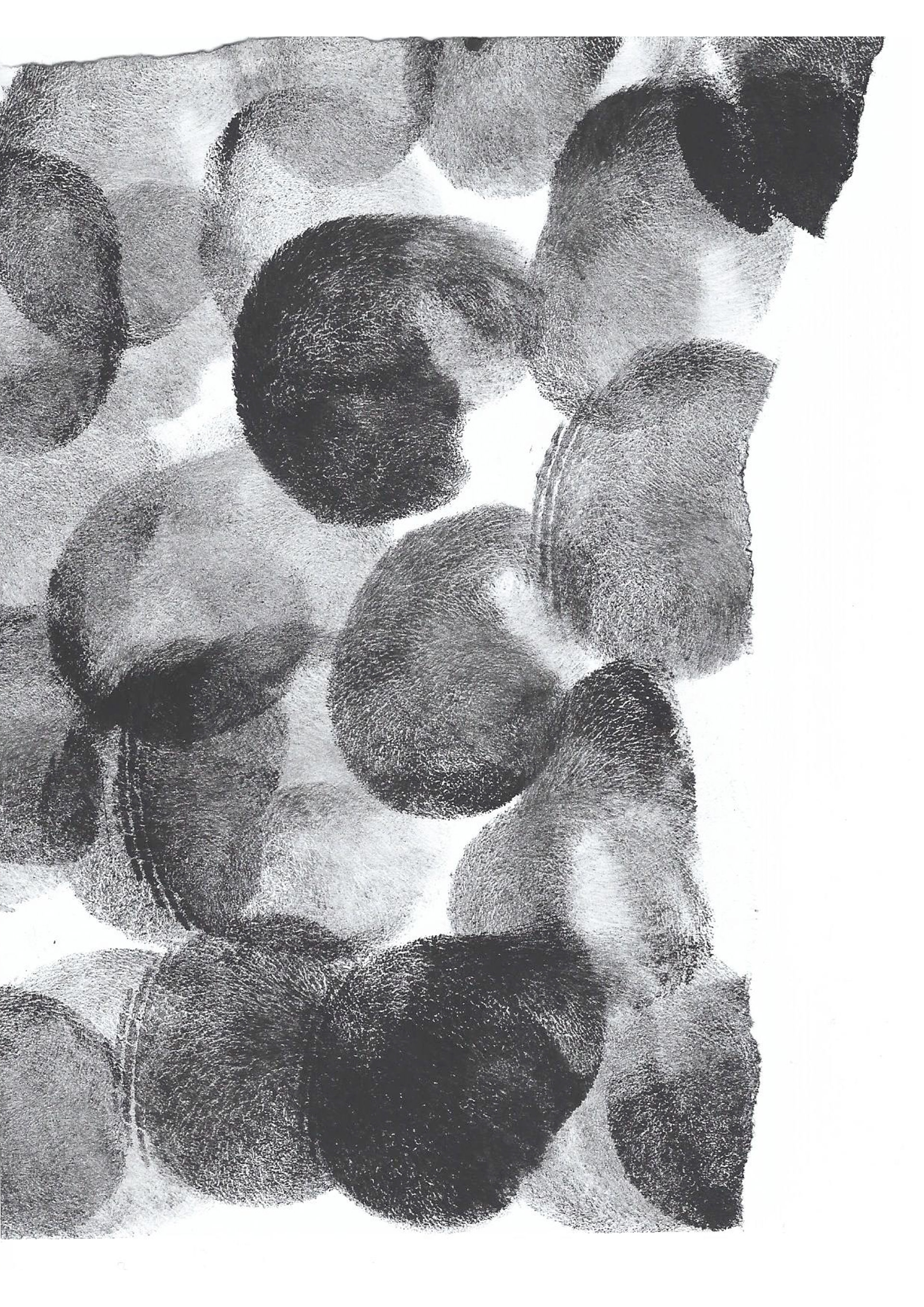
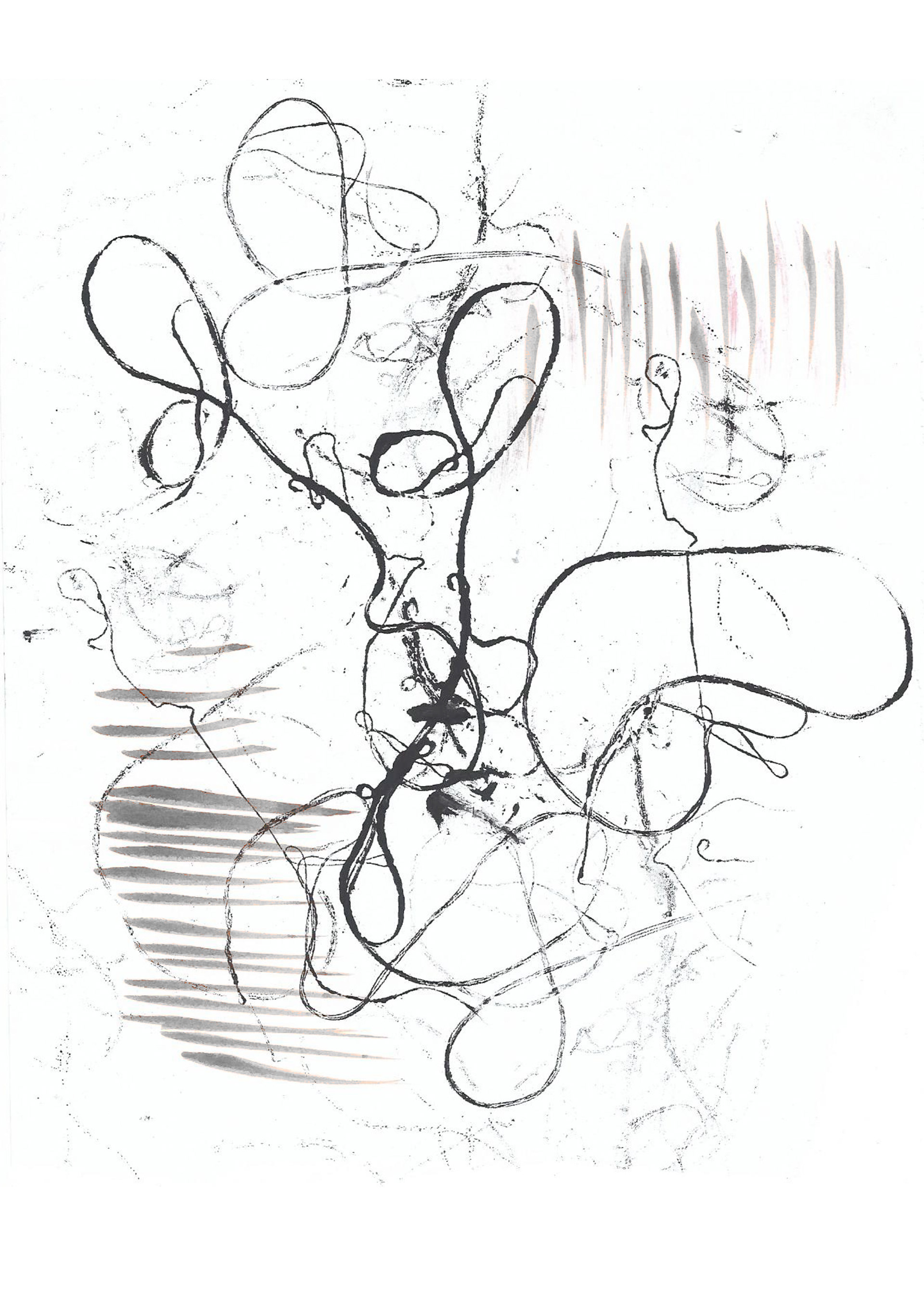
When mono-printing I focus on specific elements of design such as shape but with using different materials. I first focused on the circle, a curved surface. Using different materials and techniques I was able to identify the circle shape on multiple scales. When repeating the shape I used different force to create lighter and darker areas which can alter its connotations. When challenging these connotations the heavy black use and the neater compositions created a variety of mono-printing options.
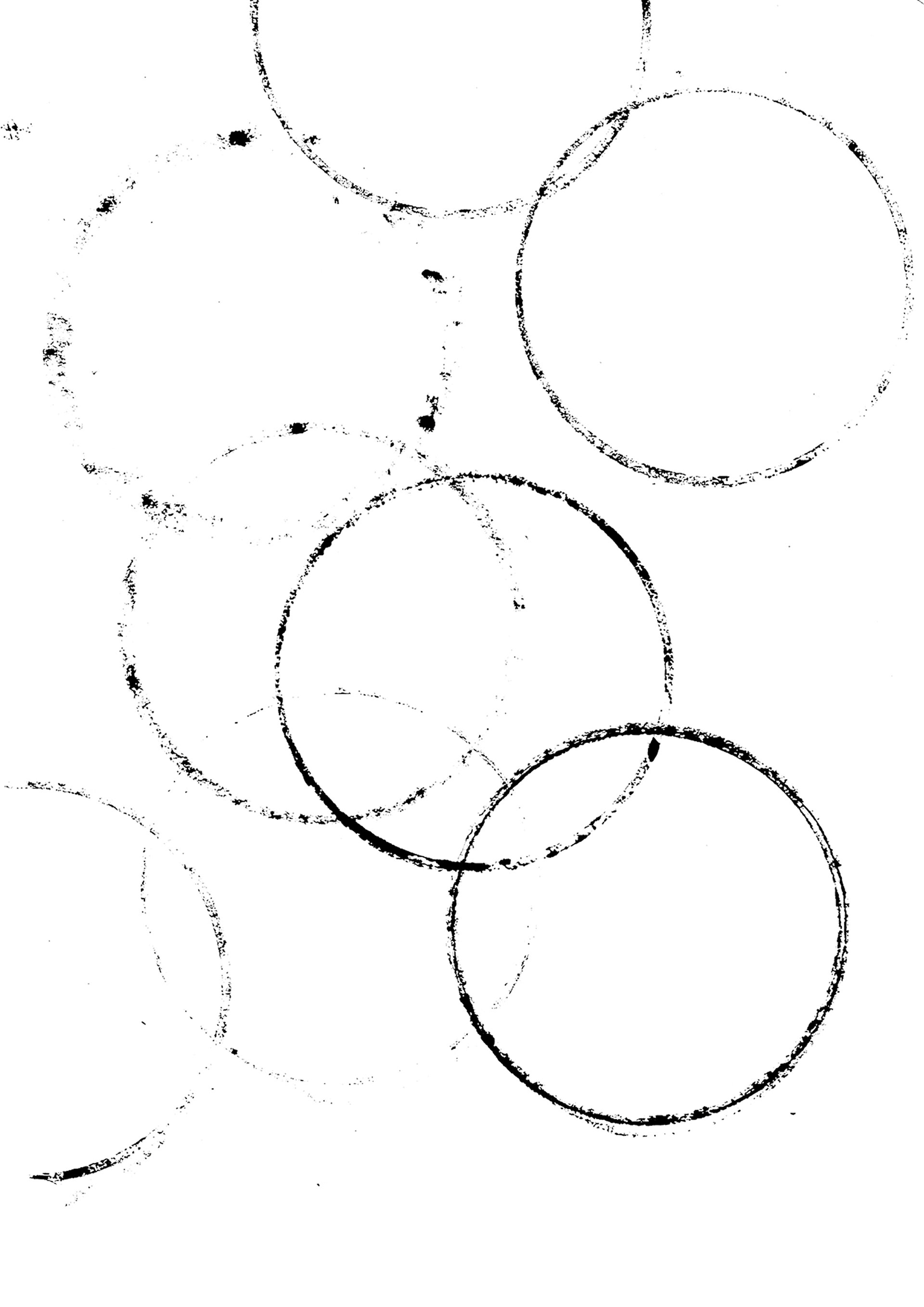
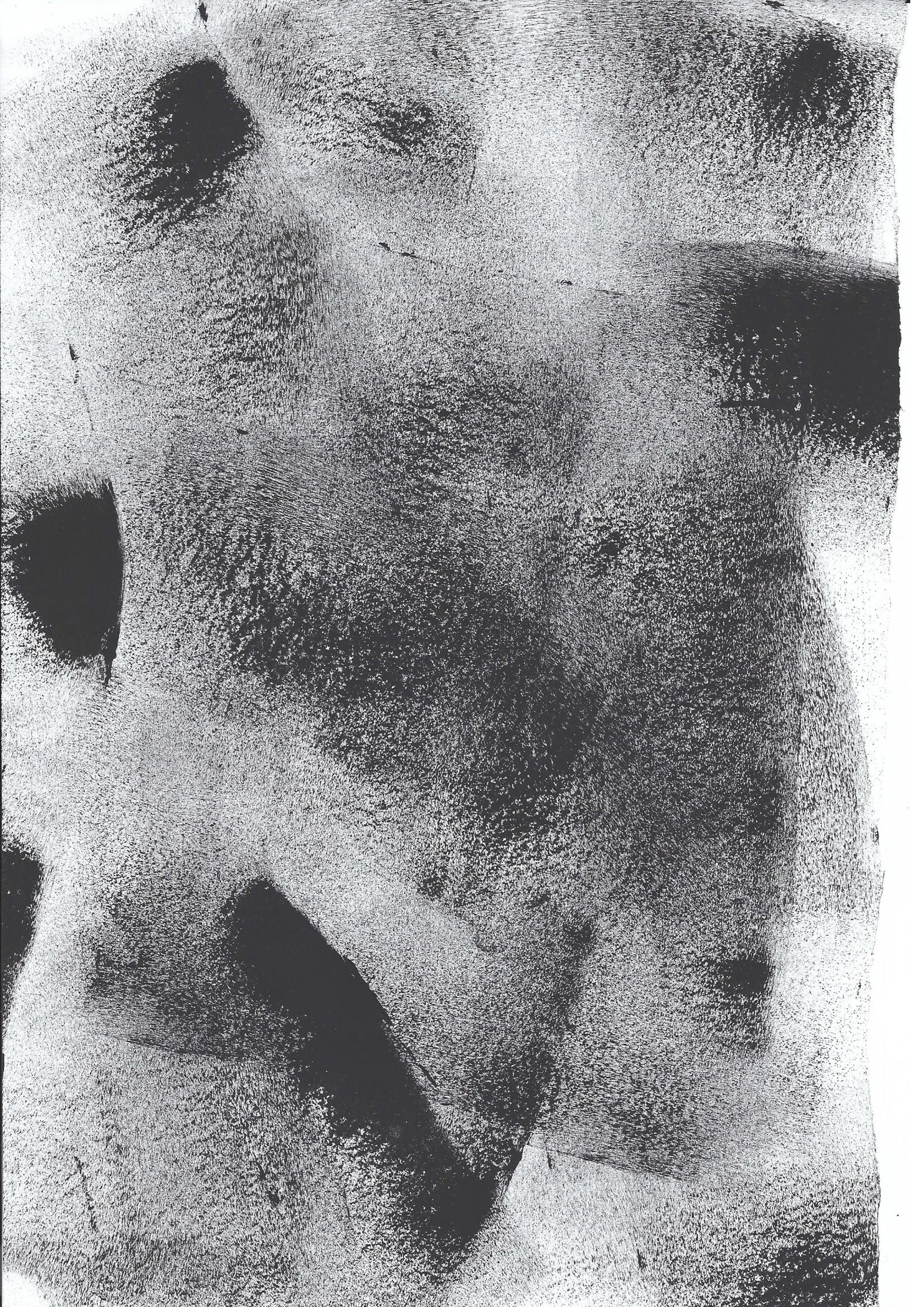
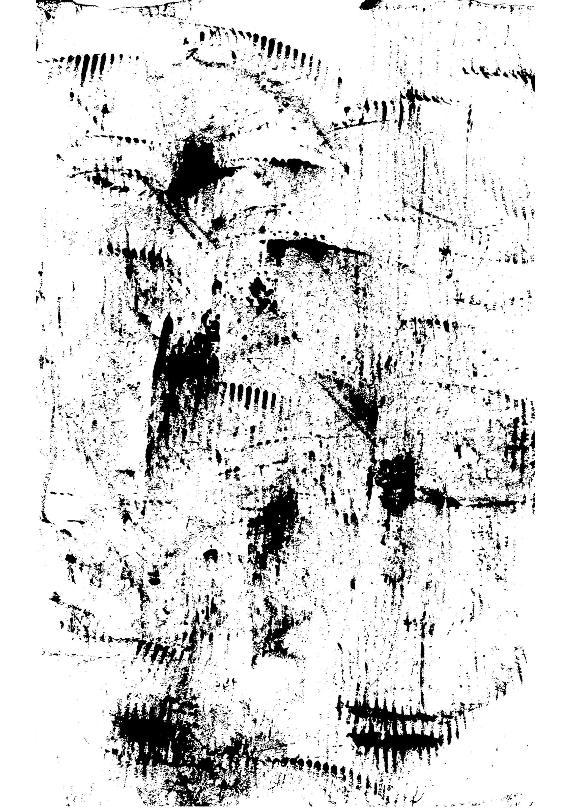
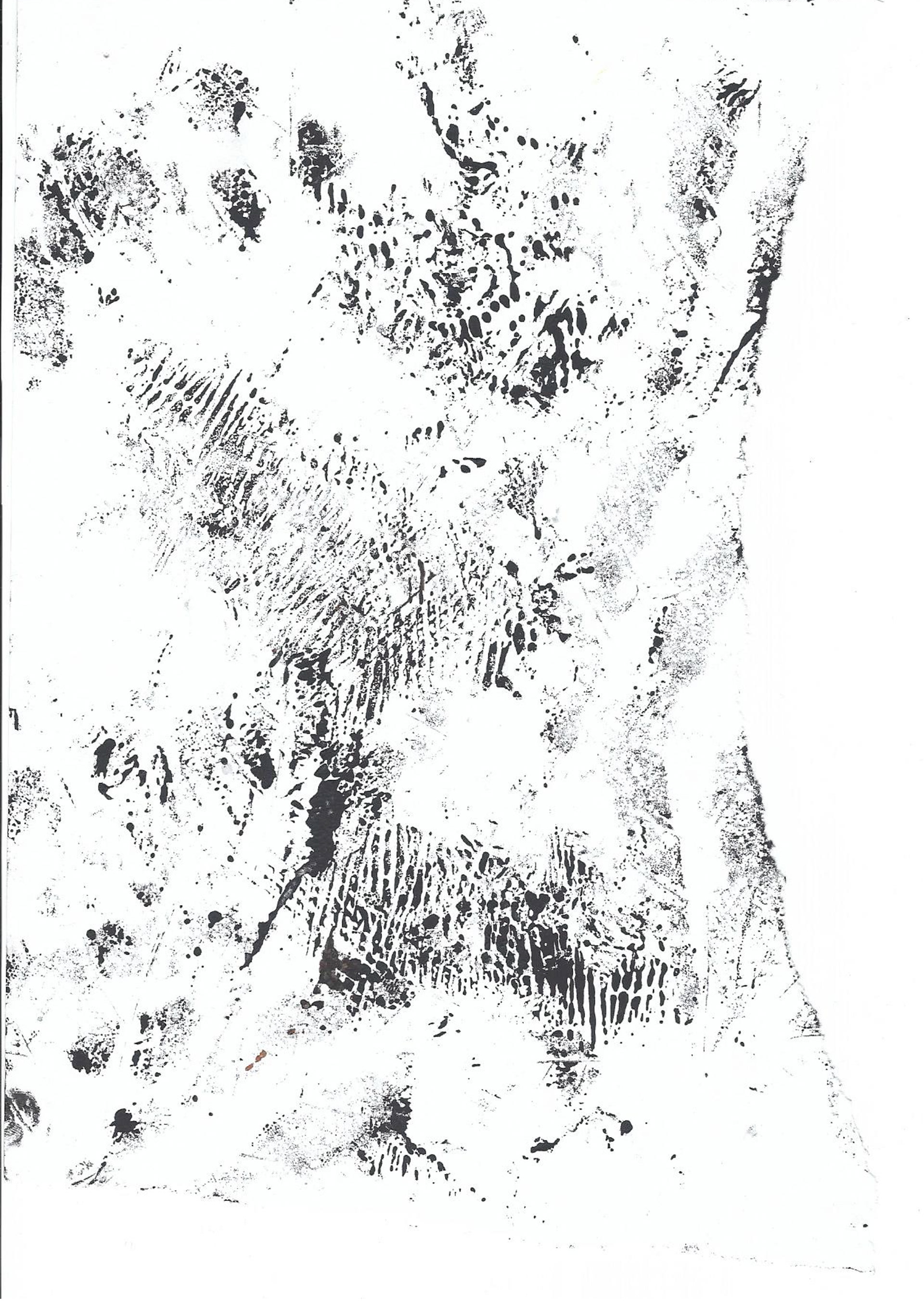
Next technique I used was a scrapping action to apply the ink. This creates an overall texture across the page which can vary in shades. Using different materials to scrape with created the different tones within a single print and in comparison to others.
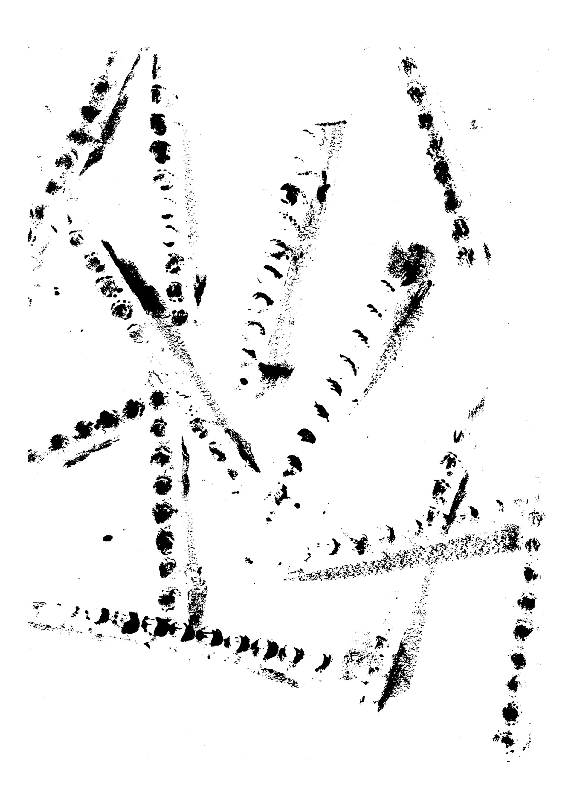
The lighter prints were created with knives and other rough tools. Its serrated edge printed thin lines of ink once it was applied to the paper, creating a lighter toned composition. Scrapping these in different directions forced lines to intersect and layer onto of each other.
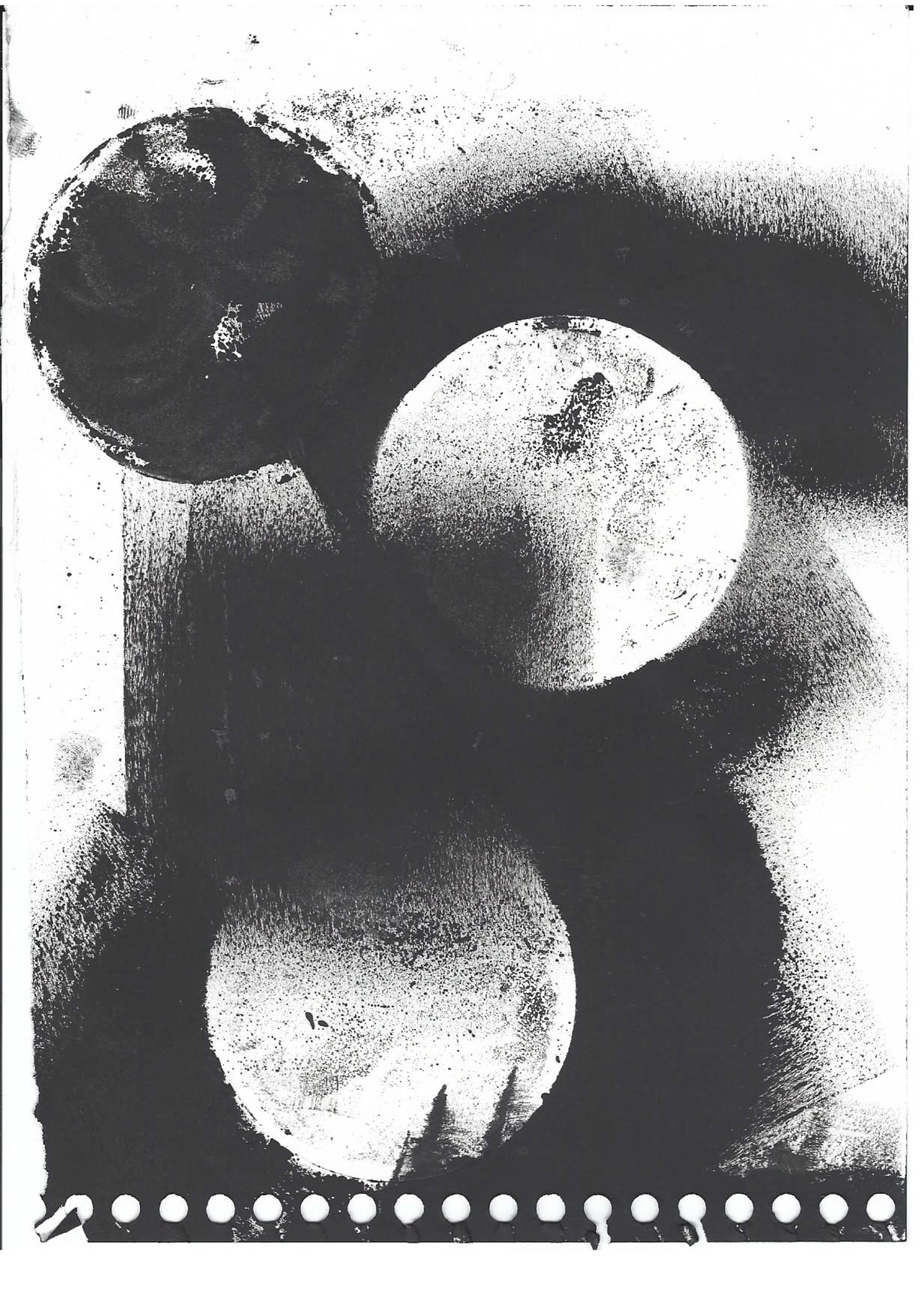
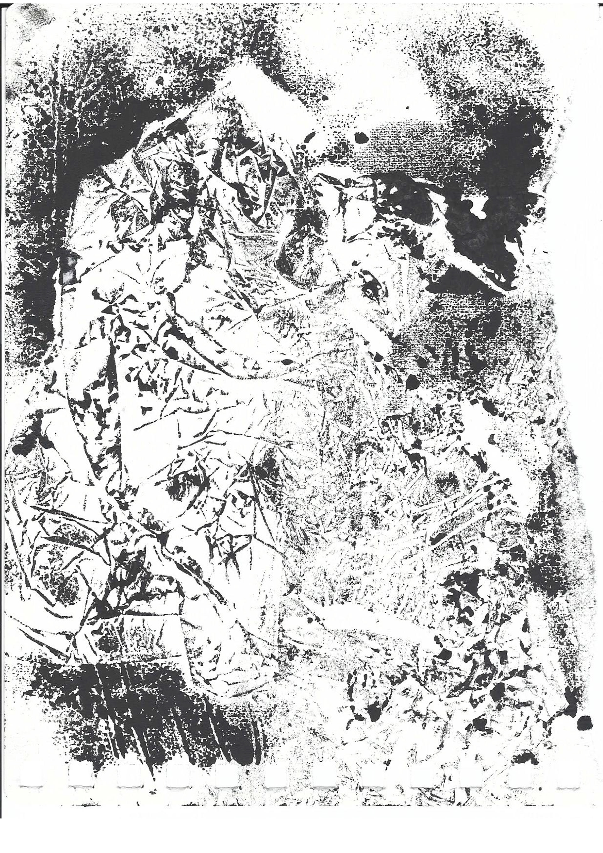
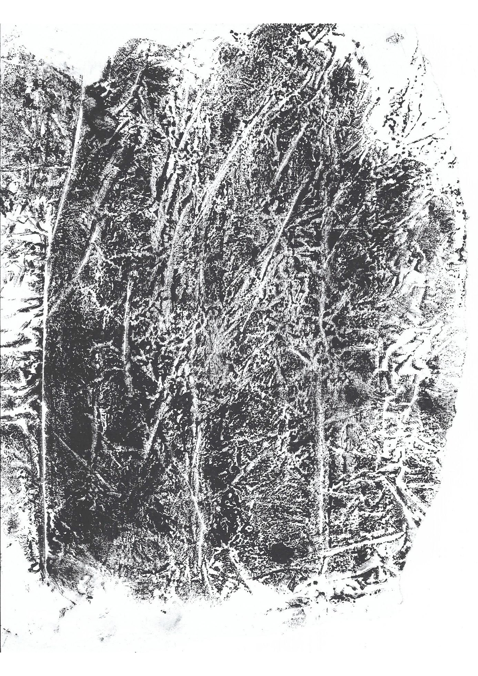
The heavier prints were created with the scrapping of paper on paper and a rough roller. Its flatter surface guided the ink across the page, filling the area. Once the ink thinned out towards the end another layer was applied. Slight layering deepens the tonal value but texture is still visible as a whole.
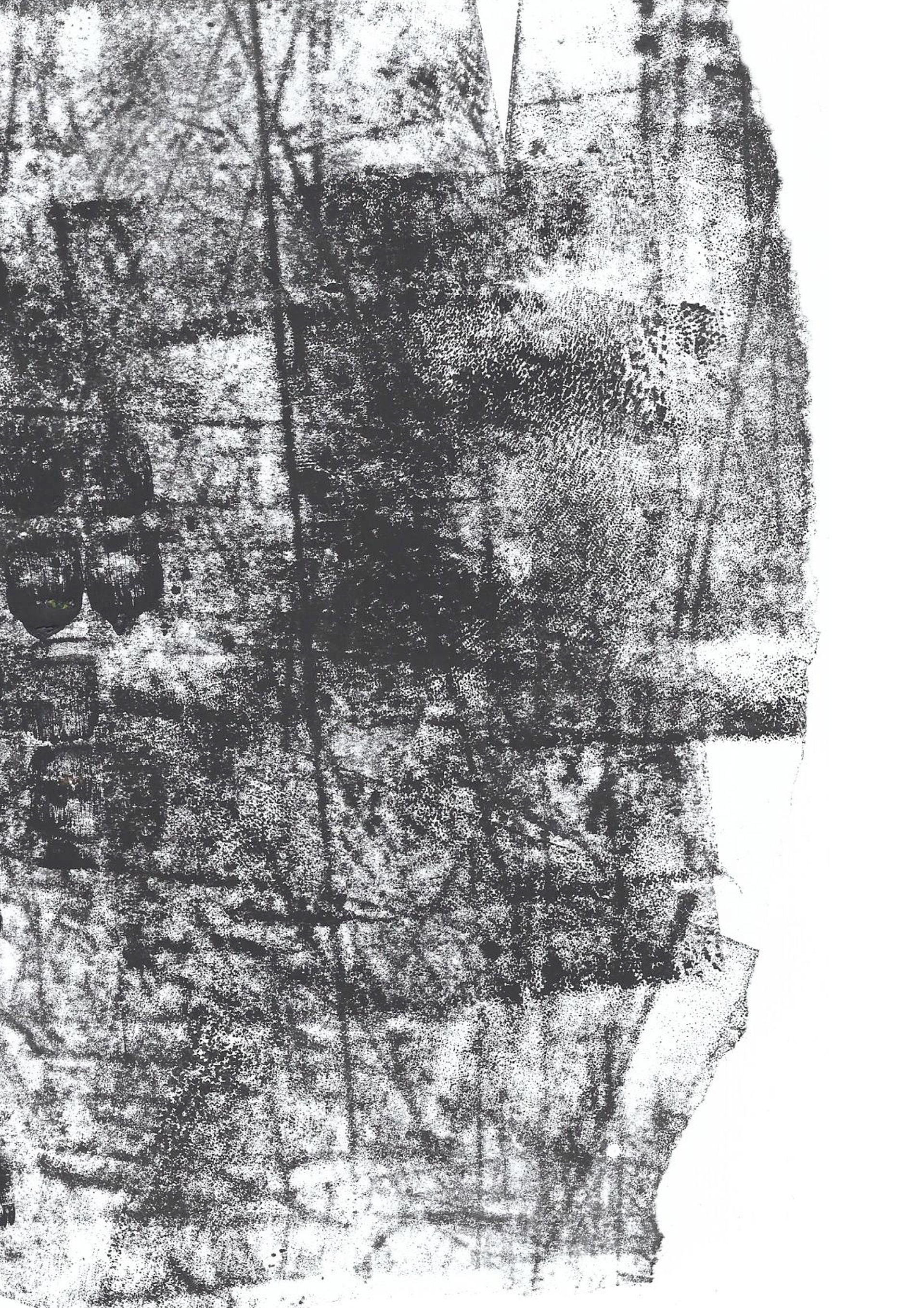
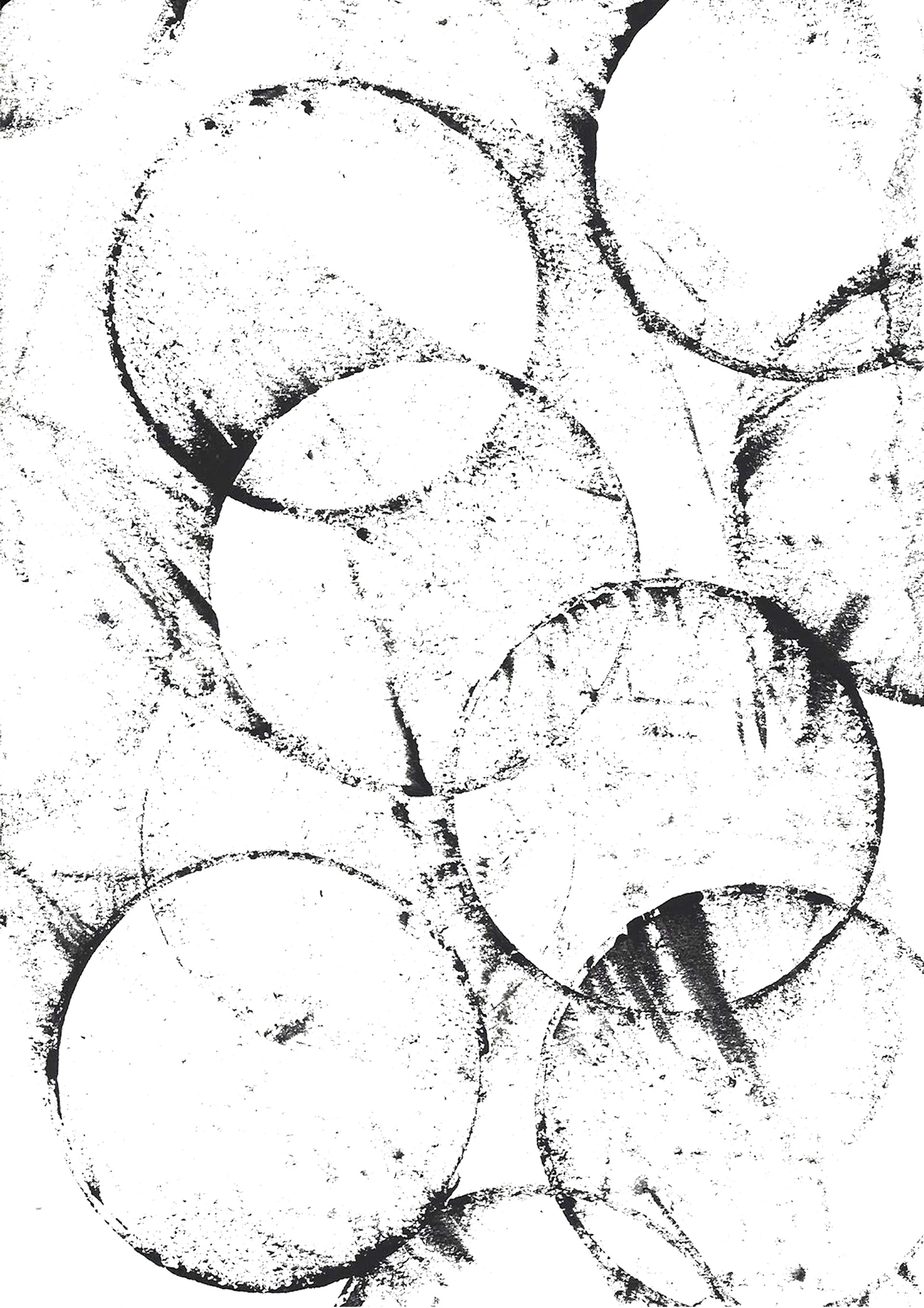
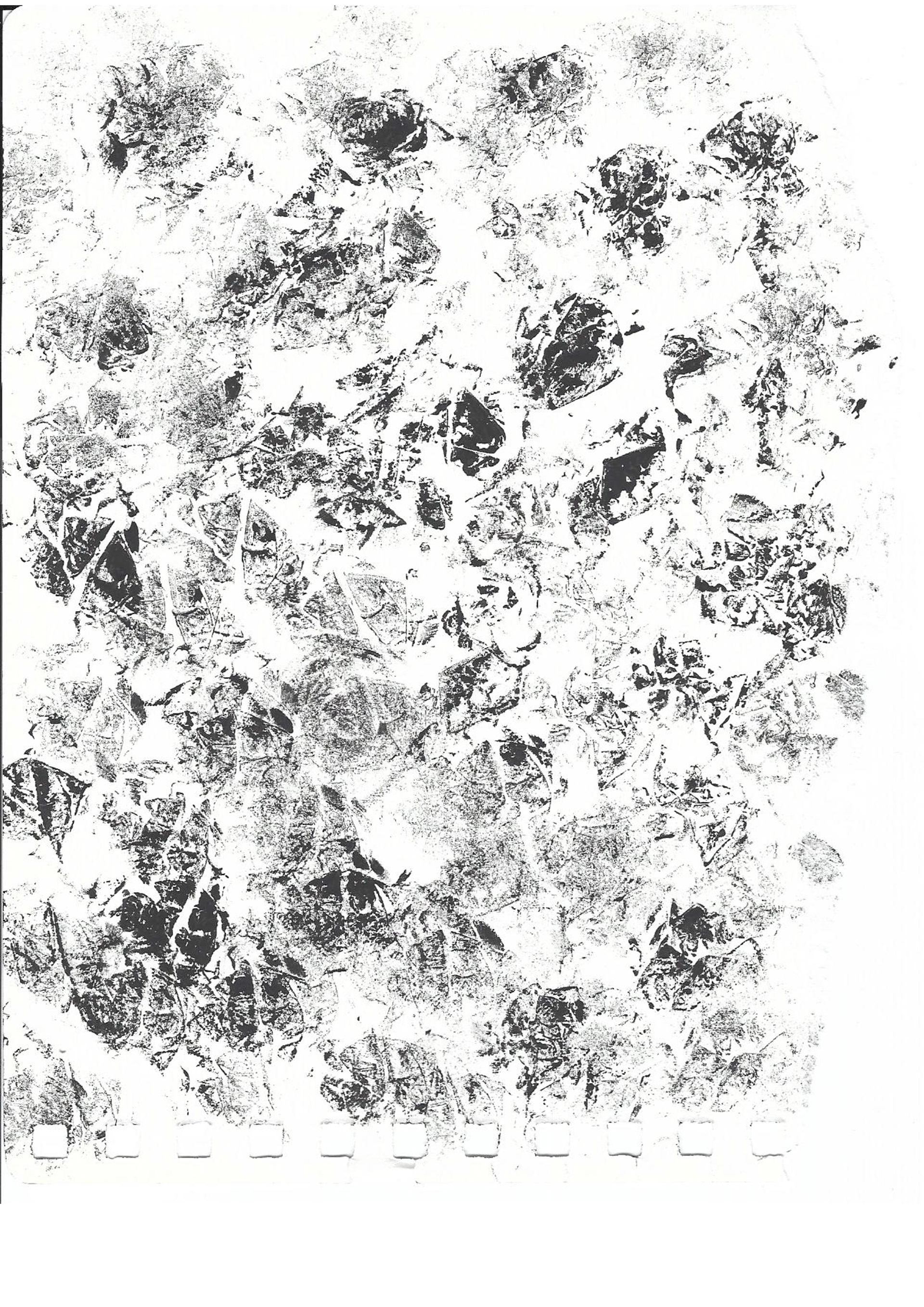
Scrunching the paper before the inking process created the most interesting effect as the ink would only reach the high points of the paper. Then once the paper is flattened an irregular pattern occurs. Each print would be completely different as it depends on the level of scrunched the paper was and the amount of ink applied to it.
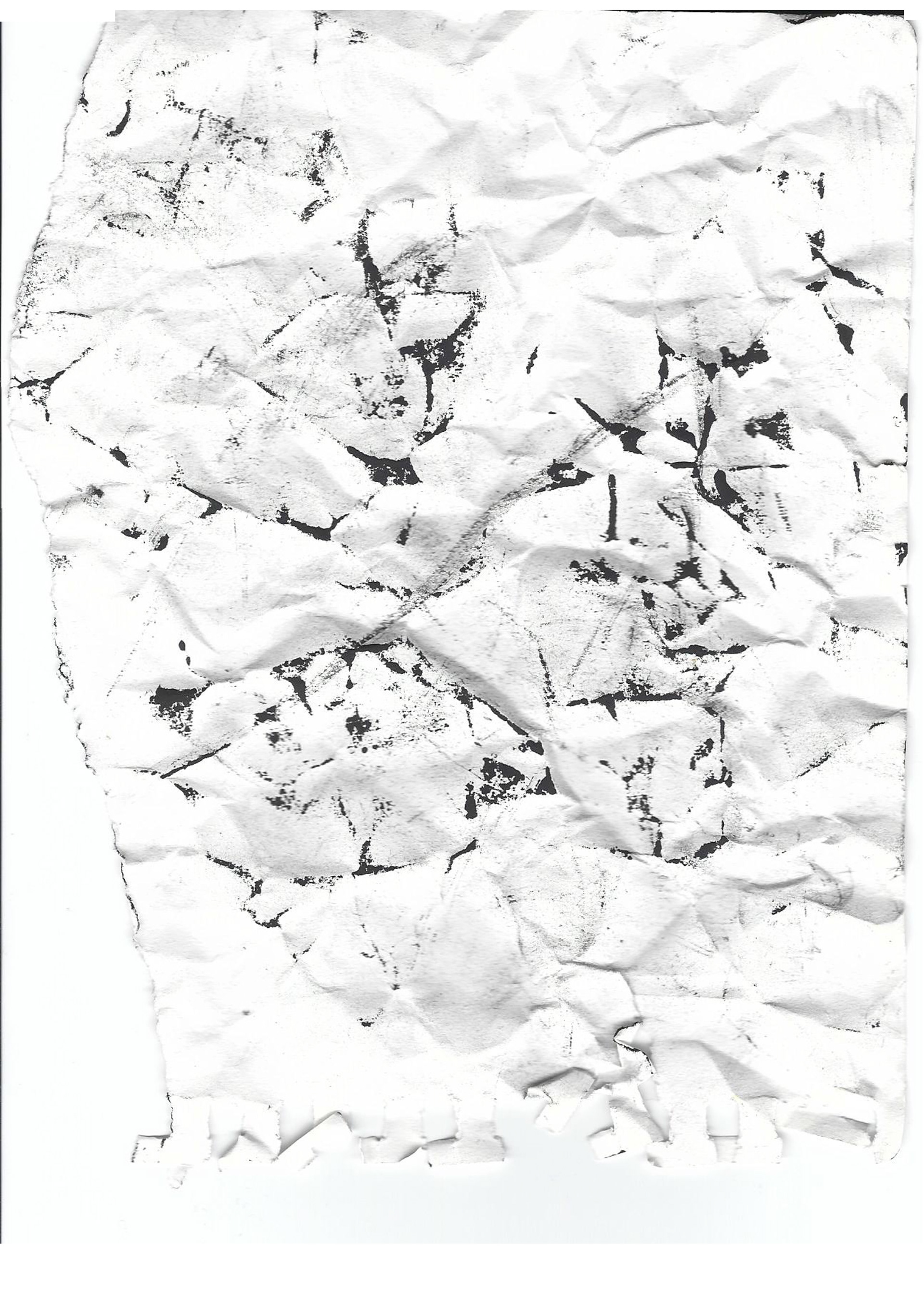
Scrunched paper was also used as the applicator of the prints. A technique was scrunching a small piece of paper, stamping it into the ink then restamping the scrunched piece onto the paper. Again this provided detailed lines as the ink would not reach the inner parts of the paper. So when it was restamped there was negative space within the stampings, creating texture.
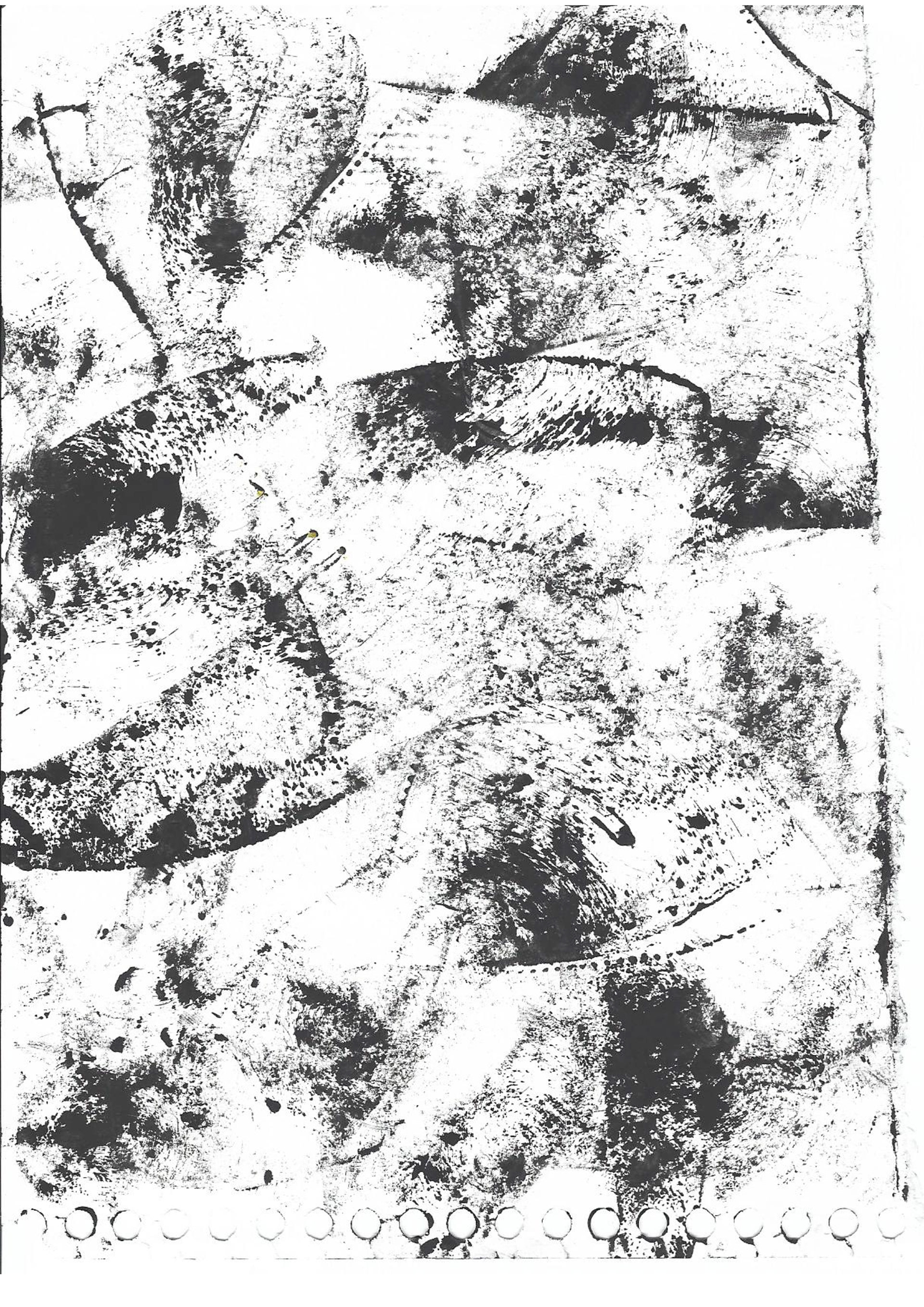
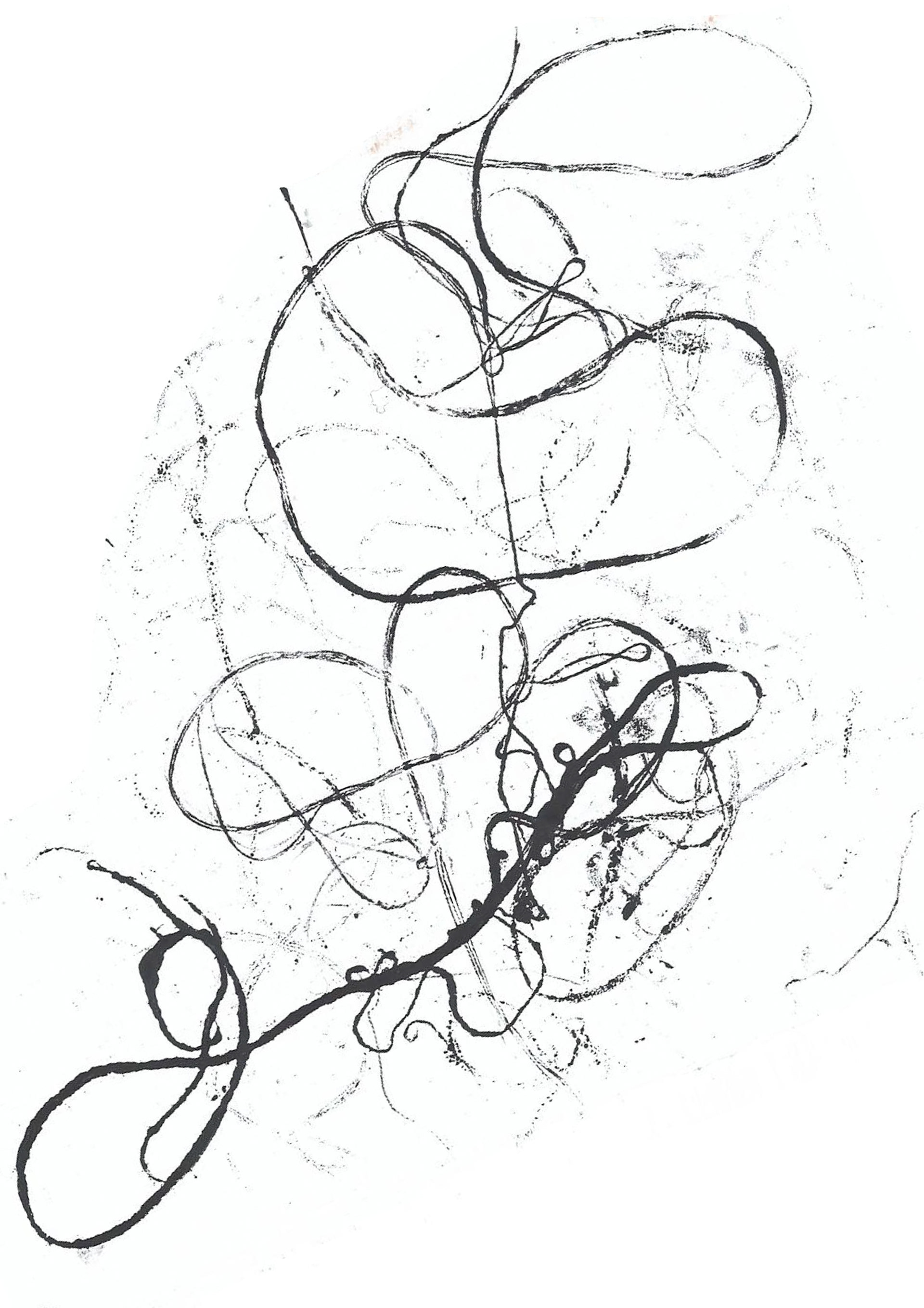
Printing and pressing was the final technique used when mono-printing. I used many different materials as the prints could be a rubbing of almost anything available, similar to the art of frottage. Using a string of thread I was able to create thin lines in different shapes as the string was easily manipulated. The different arrangements were printed, layering each print to create a more detailed texture.
Cellophane was used as printing material as the folds and creases were permanently imbedded onto the paper. Cellophane does not have good malleability, so once creased it cannot be fully flattened. This denies the ink to reach specifically creased areas printing a heavy toned texture onto paper.
When I run out of the sheets of paper I resulted in using paper from my process diary, ripping the pages out of my book. The paper has a treated edge, holes that connect through the books binding. I noticed that after some prints the under paper was getting ink spots and I came to the realisation that it is the ink being pressed through these holes. I layered these prints to create a linear and rounded texture.
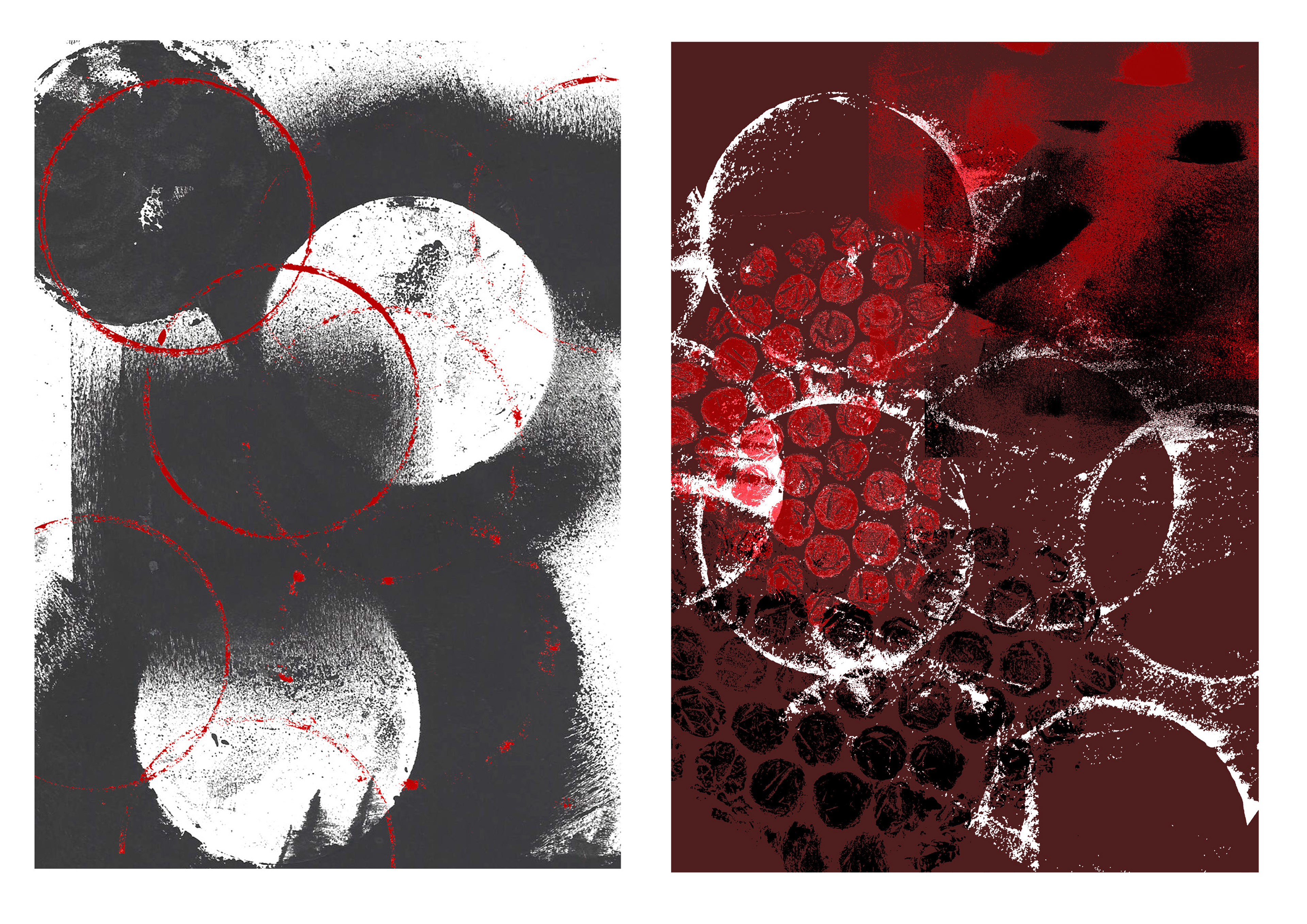
Once mono-printed the prints can be manipulated to integrate design ideas and transform them into graphic styles. On Photoshop I played with the elimination of backgrounds. For example I might only want to use the inked printed pattern, so I can discard any other marking or folds on the page and just identify the inked print. I can then layer this pattern or integrate it into other designs I have.
I can digitally manipulated a prints colour through Photoshop as well. For specific projects the monochromatic coloured ink might need to be altered into other tones or colours. Given that the prints are in black the colour manipulation can be an easy process. I prefer altering the colour and layering it with the original. Presenting the repeating pattern in different perspectives.
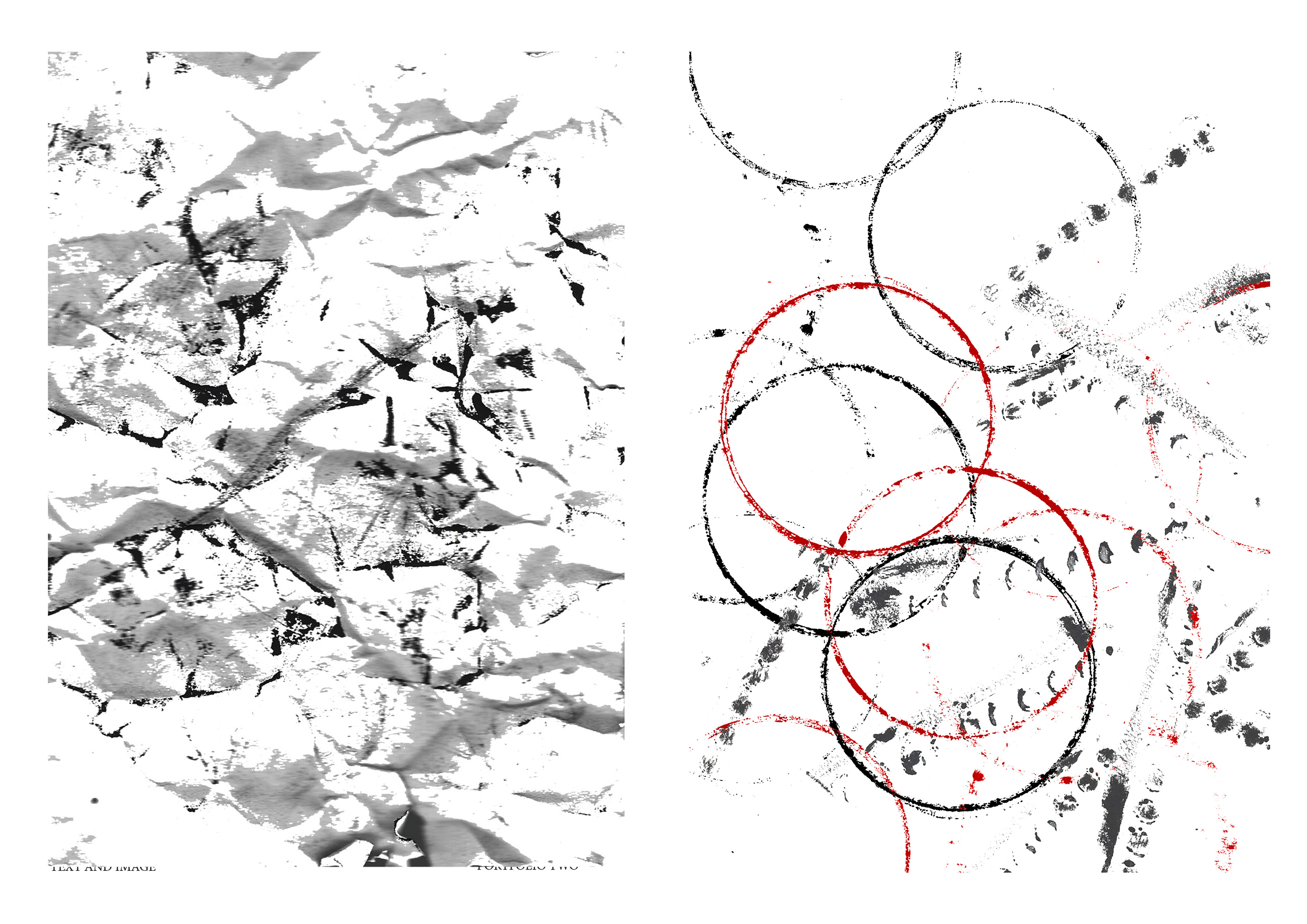
Layering prints is the next step in manipulating the designs. Once the background is transparent and colour is altered to preference, it can be layered onto of another design I have printed. This can create parallels between two works and can take a simple design and elevate it conceptually and aesthetically.
After these small techniques the prints can be combined using a range of these manipulations. The basic prints look basic and non purposeful but by adding cold and other different manipulations textures can be created and a re ned design can be the result. The final output can be then adapted into zines, album covers or posters.