Materialisation 1
Materialisation 2
Materialisation 3
Materialisation 4
Materialisation 5
Materialisation 6
Materialisation 7
Materialisation 8
Materialisation 9
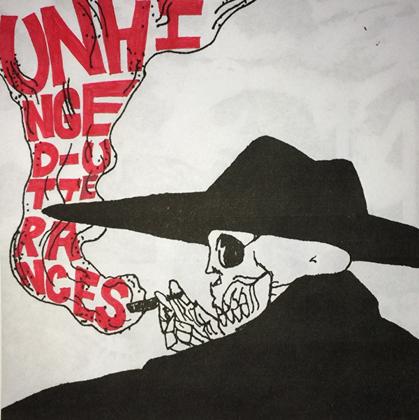
Materialisation One being the most literal representation of Image and Form, I chose a monochromatic skeleton smoking the words unhinged utterances. This was an initial idea as bones, especially the human skull connotes ideas of death and mortality. The focus on the human skull than other bones is due to a greater visual appeal and the juxtaposing idea that the symbol can both fascinate while simultaneously repel viewers. Similar feelings expressed in the film Quinoa. Building on the familiar connotations of the skull, bold red typography was used to connect the eerie, schitzy expressionism in its most literal form.
The chosen text, unhinged utterances, is to present the action of saying or expressing something aloud, being deranged and mentally unbalanced. I positioned the typography to be intwined with the smoke, a cigarette adds suggestions of excitement, and of danger. Through the depiction of the words I was able to create a rhythmic fluidity between Image and Form.
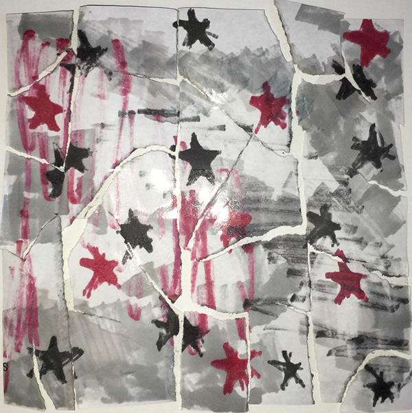
Still keeping the literal ideas of form, I wanted Materialisation Two to be inspired by a self written passage. The passage reads:
‘A child laughs, a child cries … memories of a protected past … visions of a vulgar future … and yet the child tries.’
This text was inspired by the physical attributes of Stein’s ‘Tender Buttons’, I wanted to create a rhythmic pulse throughout the passage but also if read backwards, readers can still gather similar meanings. So to do this I scattered the text to force a break of speech.
Upon feedback it was discovered that this use of text was one of my weaker designs and needed to be discarded from the project. I understood why this was so but I still wanted to use the passage in some way in my final squares. Instead I designed my second Materialisation based on the poem. I personally connected with the last line ‘the child tries’. I believe that as children we always see the good in the world and convince others this is so. As we grow up I also believe that our inner child still tries to make sense of the world through this lens, trying to see the positives in a destructive world. The taped up rips of paper is to represent the ability of a child fixing the darkness and brokenness.
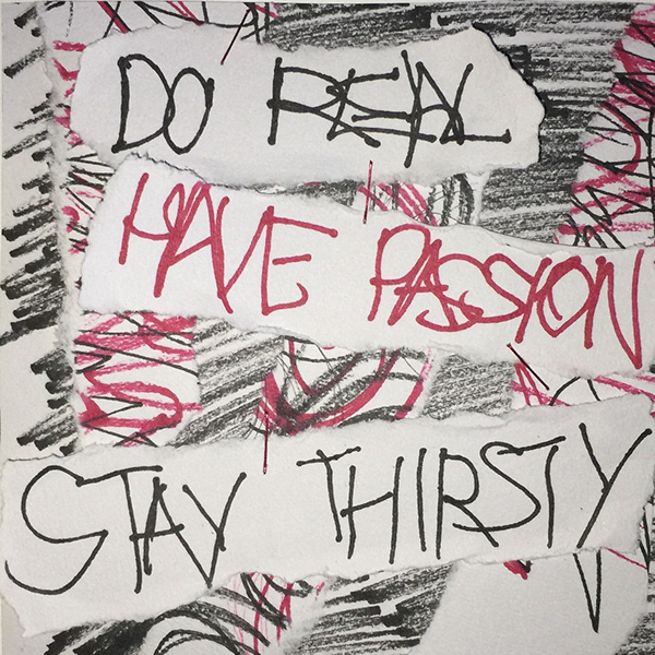
In Materialisation Three I’ve written demented child-like typography which reads ‘DO REAL, HAVE PASSION, STAY THIRSTY’, aggressive terms. The eerie and uncomfortable ripped shreds connotes an attack and frantic behaviour, non human like. The rapid markings indicate schitzy actions and mentally derranged. The repetition and rhythm is created through the static and linear strips, generating multiple directionality’s. I was strongly drawn to scribbling as it is to draw lines that have no particular meaning in a quick and careless way, and I found this definition fascinating. For something to have no particular meaning is an unsettling thought as I connect this with words itself. In society we have socially applied meaning to many words in the language. Feelings and connotations have been derived from others definitions.
This is an expression of ‘Tender Buttons’ and its fragmented poems. It is experimental in nature and uses adjectives that aren't present in the original depictions of the object. This demonstrating the same principles as ‘scribbling’, to have no particular meaning.
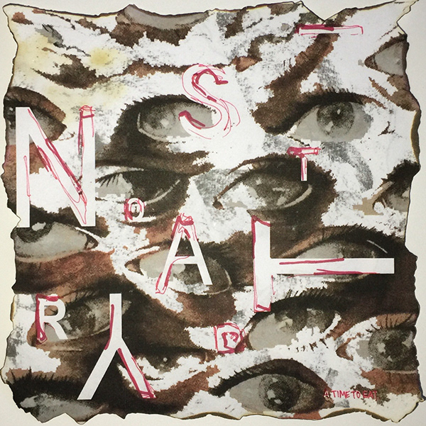
Still keeping in mind that it is still literal in form, Materialisation Four uses text appropriated from tender buttons directly, the poem ‘A TIME TO EAT’. The last line reading:
‘This is not tardy.’
I have abbreviated this line to read ‘is not tardy’. Through scaling and proportion I have manipulated the letters so the viewer first sees the word ‘NASTY’. Nasty is unpleasant and offensive, using this word to further feelings of frightening eeriness. The abstract background of eyes represents another form of communication, being visual instead of auditory. I wanted the eyes to depict unsettling feelings through the uncomfortable gaze and flickering stares. The burnt edges was created with claustrophobic intentions to portray feelings of an enclosed space, closing in. Fire consumes, warms, and illuminates, but can also bring pain and death; thus, its symbolic meaning varies wildly, depending upon the context of its use, highly interpretive.
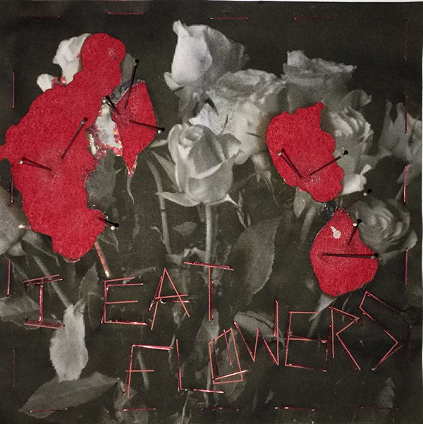
Progressing to Materialisation Five, I began to further express my conceptual ideas surrounding rhythm and words. With this in mind, I wanted to experiment with the happenings of broken statements, thus removing its context. I chose a phrase that presents flowers as a symbol of beauty, a feminine statement that yearns for perfection. This reads:‘I eat flowers, because you are what you eat and I want to be beautiful.’
I abbreviated this statement to read, ‘I eat flowers’. This suddenly turns the statement into a strange and creepy depiction, creating a narrative up for imagination. The use of staples to write the text now changes the original concept of soft and fragile flowers, to the hardness and sharpness of metal.
Another layer of meaning in addition to the text is the motif of black and white roses, with red cut outs. The roses hold multiple juxtaposing meanings. Red being passion, repeated concept from Materialisation Three, an aggressive term that is in opposition with the white contrasting roses depicting purity. Another idea being the black and white colour scheme that connotes the battle between life and death. The combination of all juxtaposing elements and unsettling text has created strange and interpretive conventions.
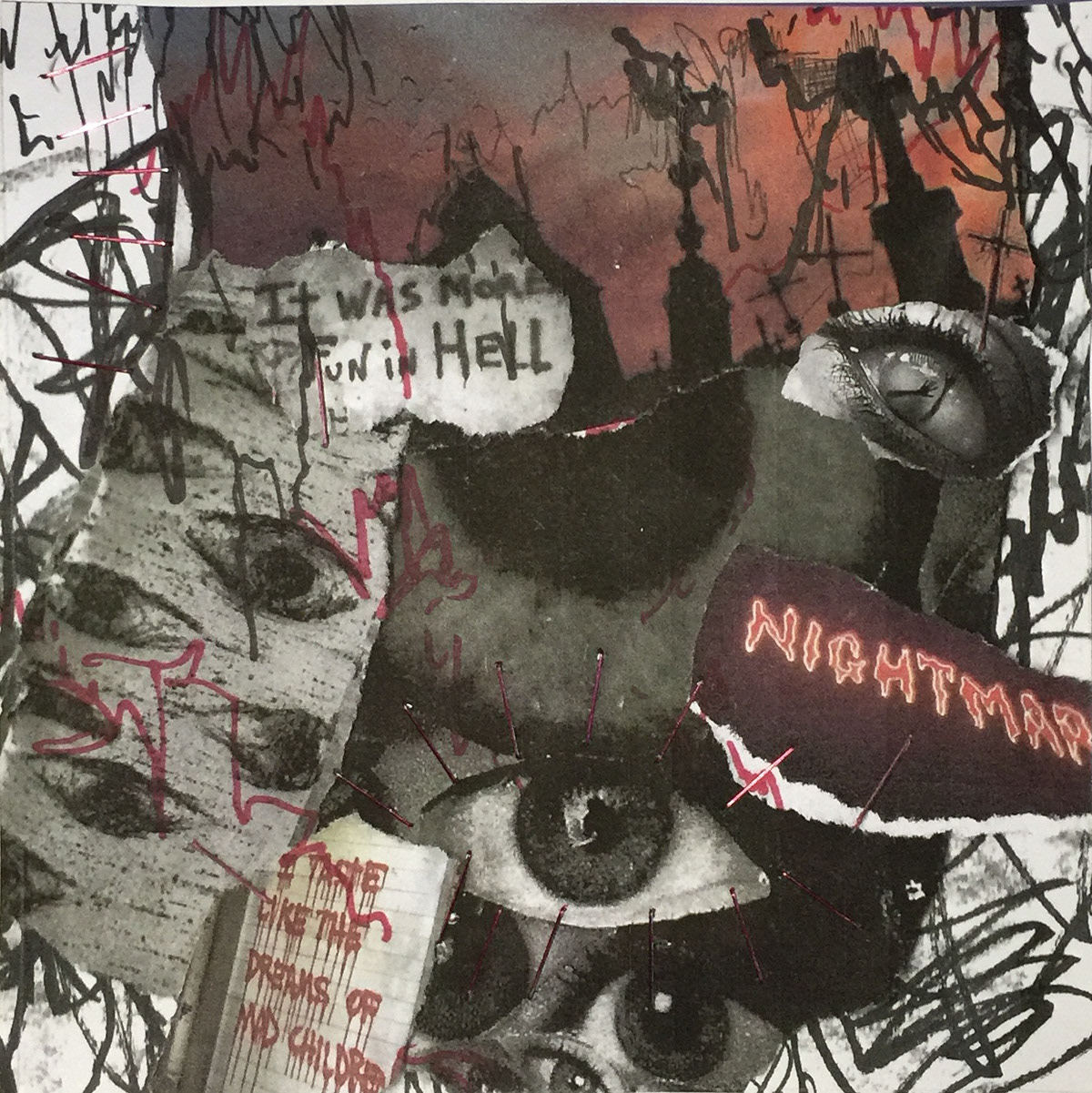
When moving onto Materialisations Six to then Nine I pulled away a bit from the focus words directly and used squares One to Five to expand inspiration and concept. Materialisation Six is a collage of haunting images and text loosely stapled frantically in place and ripped in shreds. This is to represent the fragility and ephemerality of life, a terrifying revelation I believe we all choose to ignore. The collage is to represent the delusions and hallucinations that can be experienced by schitzy personalities. Scribbling was also used as the background piece to present layers of fright and panic. Another recurring motif is the eye, a gateway into the soul, to tell stories of many. There is also suggestions of the evil eye, cursed when subject is unaware, malevolent glare. Also the repetitious position of the eyes create a visual rhythm across the square.
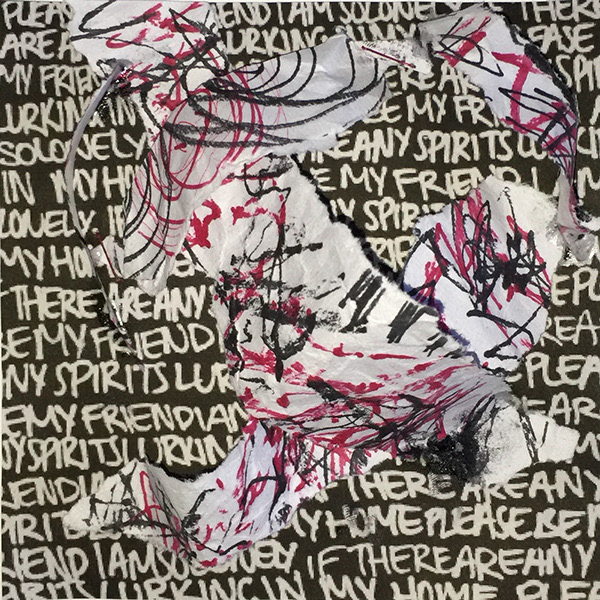
In Materialisation Seven the ripped shreds are remnants of Materialisation Three, fallen pieces, forgotten, discarded, spite, ill feeling. The standing structure is irritated, agitated, awakened. I have inversed the colours of the background so the Materialisation would hold darker aesthetics, referencing key word eerie. The inverted text in the back ground reads the reoccurring chant:
‘If there are any spirits lurking in my home … please be my friend I am so lonely.’
I have personally experienced loneliness growing up and consistently fear change. This fear of change is what encourages me to hold onto the past, not disregarding memories or experiences. This has inspired the design of this square as I tend to hold onto even scraps of materials as I install a personal memory onto them.
Manipulating the torn paper into a fluid rhythm gives me power as the controller, referencing the control of David Lynch in Quinoa.
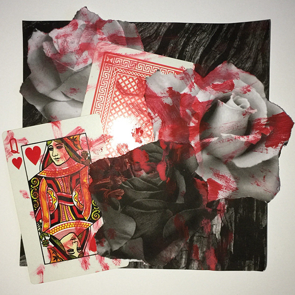
For Materialisation Eight I needed to further conceptualise original stimuli Quinoa and Tender Buttons. I then discovered that they both hold the same characteristic of the corruption of stories. Both are initially innocent, either simply describing everyday objects or an easy cooking tutorial. But through further exploration and research, as a collective challenge conventions and force a change of routine. The simple innocence is merely just a covered front, controlling the submissive. As viewers and readers we are to believe that the fragmented story structure and film scenes should be seen as normal, text and film. A transcendence is clear in both stimuli, which challenges audiences understandings but are unsure why, thus is unsettling.
The violent red brush strokes covering a frantic collage presents these same values. Slashes of red over playing cards emphasises the idea of a corrupted childhood. Yes, the white roses are symbolising peace and tranquility but there is a covering of malice and struggle viciously expressed through slashes of red. I can personally relate to this concept of masking, as I believe many people must need to put up a front just to survive, fooling others to believe that they are okay. I also believe that everyone has their breaking point, overcome with emotions, outbursts of dark scenes.
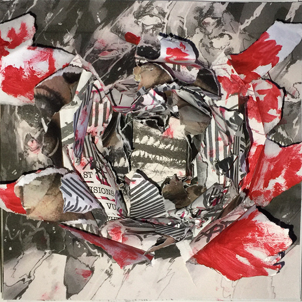
In the last Materialisation, I wanted to enrapture all previous squares as logically this is a combination of all. Each layer is torn through aggressively, which opens up all memories and experiences from the past. Each layer differs in tonal value, some being lighter than others, this entailing that the human experience is diverse and has bright days verse dark days.
Once ripped, it cannot be fixed thus resembling trauma and how it can destroy meaningful relationships and alter ones self, irreversible. The hole appears darker underneath all the layers, this is representative of human existence. The deeper you invest and open into a persons past and experience, the more likely you will uncover dark truths that we all must carry heavily. Haunting revelations are observed being that the end is just the beginning and all beginnings must end, represented by the same image layered as the first and last picture. I also understand that feelings such as these can be uncomfortable for some, so with the last Materialisation, it has been ripped open, exposed, forcing everyone to bare each destructive layer.
With all of this in mind, the Materialisation interpretively encapsulates the instability of human existence. The violent actions speaking louder than words.
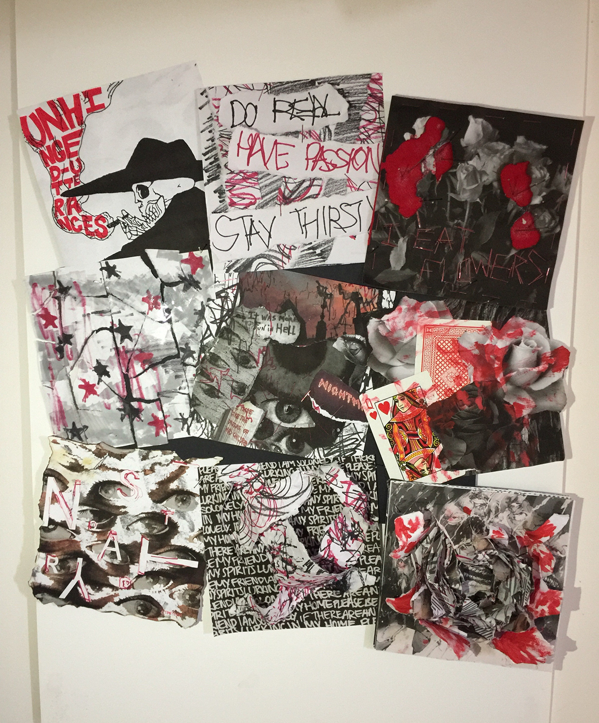
My final arrangement of squares is inspired by a serial wall curated by an obsessor. Similar to newspaper clippings or photographs being pinned together on a secret wall. I founded this idea from Quinoa being that the controller is the obsessor.