David Lynch 2006 Quinoa, presents a juxtaposition between the serious black and white lm with intense horror like music and the elemental value of unseriousness, being that the contents of the video as a whole is quite unimportant - just him cooking. The non- physical traits of the film is what interested me the most about this stimuli, which sparked connections between video and text. Feelings of doom and haunting nature, added to the thriller like production. The lighting arrangement, connoting strong german expressionism, suggests that the darker settings are more serious and contains personal discussions.
This is seen also through the brighter lighting change when Lynch returns to the kitchen, giving mundane cooking instructions. Another haunting element to the lm is that Lynch himself is imagined to be the controller of all things, being the food, music, and communicating with the people behind the camera. This power of control coupled with the dramatical lm techniques instills feelings of being uncomfortable and unsettling. The light-hearted yet eerie structure of the lm then builds on underlining expressions of schitzy and transcendence. is stimuli was used as the base of my created fonts concept, through underlining meaning and connotations of an eerie presence. Through a wide range of inspiration and applied production development I was able to produce a personal font that had clear structure and legibility.
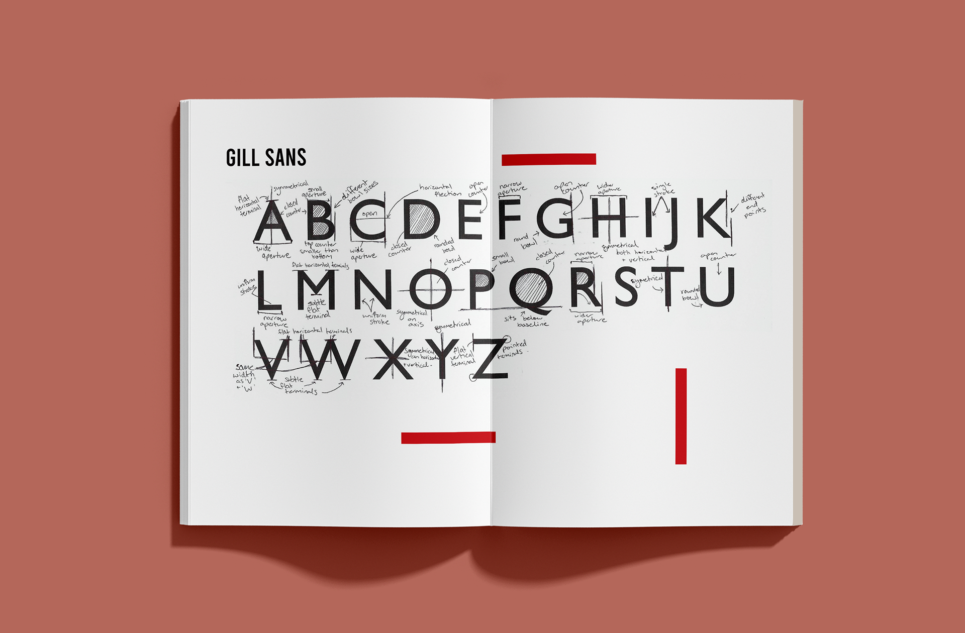
Gill Sans is a sans-serif typeface designed by Eric Gill and released by the British branch of Monotype from 1928. is font has a handwritten quality that guides the eye horizontally. is makes Gill Sans ideal for reading long passages. Each letter ranges from narrow to wide apertures and contains a consistent stroke throughout. All letters have the feature of subtle at terminals, allowing it to be read softly on the eye, rather then any striking elements. However, ‘Z’ consists of sharp pivots when pen stroke changes direction, breaking this rule. Letters such as ‘H’, ’O’ and ‘X’ are both symmetrical on the x and y axis, improving constancy as a whole typeface. e only letters that break the baseline rule is ‘Q’ and ‘J’, as they sit below the baseline level of the other letters. I am inspired that such a holistic typeface still contains some outliers, subtle rule breaking elements throughout its structure. Even through the form is not the same throughout, the font is highly legible and all apart of the part of the humanist family.
Initial stages proved most important to the holistic outcome of the font as this is where the basic structure emerged. During class studios we were encouraged to put pen to paper with no real intent at this stage. The aim was to get the hand and mind loose and start creating different stroke patterns. As the lines developed we were encouraged to start getting creative with the mundane action, this involved factoring thickness of stroke, the angle and it’s kerning. Once comfortable, the restrictions lifted and the additional elements of curves and shapes were introduced. Once the hand and mind were loose and comfortable with light intentions, the class was able to move in our own direction and style. The aim for this next movement was to create strokes with intent of it appearing as if it was text on a page. e strokes turning into shapes, turning into lettering.
The human experience has conditioned us to view letterforms into structure and sentences. So combining all elements of stroke, kerning and shapes on a staff created the illusion of a passaged text on paper. is all still limited to a few strokes for each initial concept. When a style has been successfully achieved a new staff was added to fill with that particular style. is development was important as it made the font clear to any flaws or undesirables. Dedicating a whole staff allowed the stokes to be properly analysed and gather its possibilities. As a class we could then identify the possibilities and opportunities of the style and also its limitations. Once expressed thoroughly, I returned to the experiment staff until I created another style worth exploring further. is continued until I found that I achieved a wide variety of options that had specific aesthetics and intended outcomes for further development.
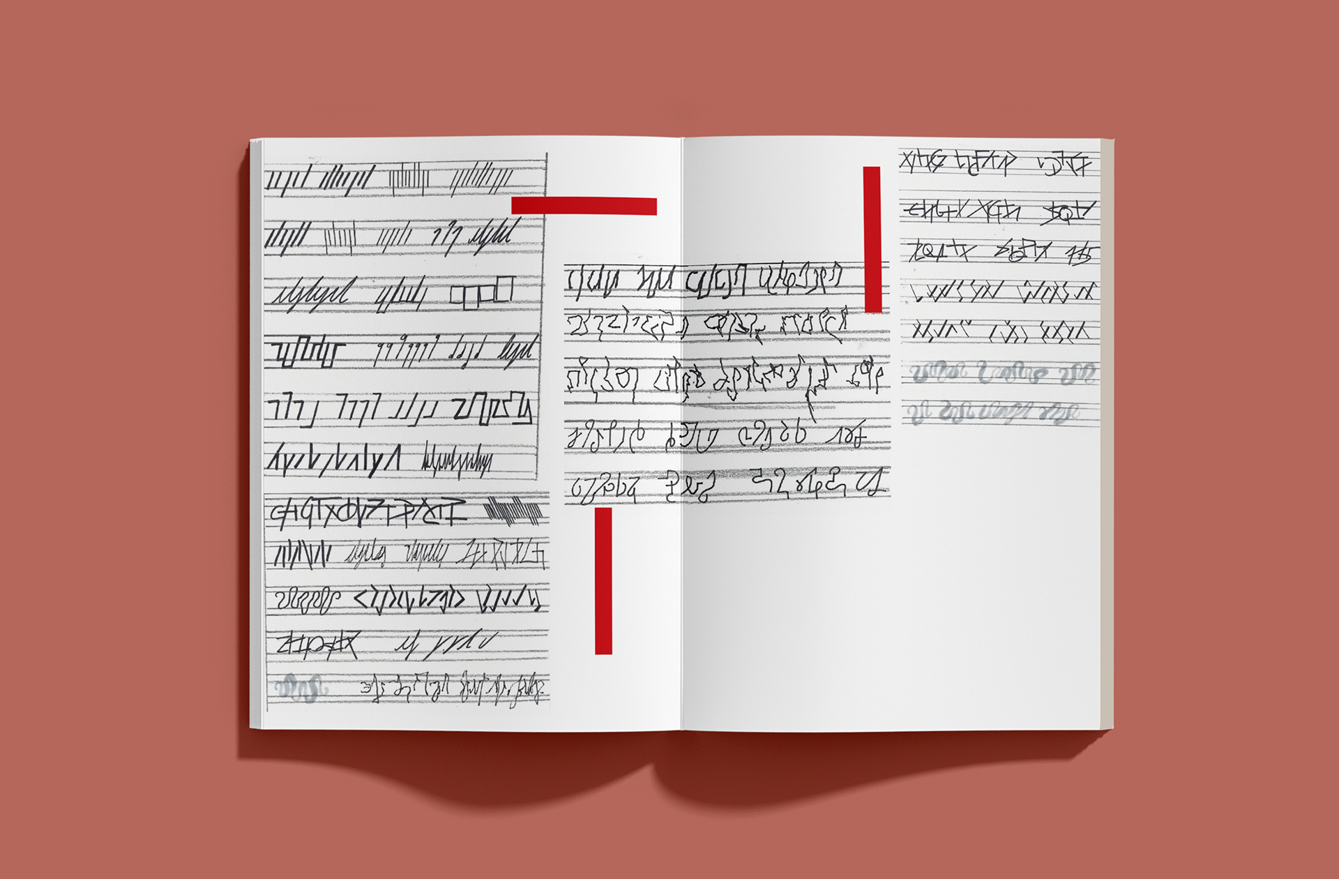
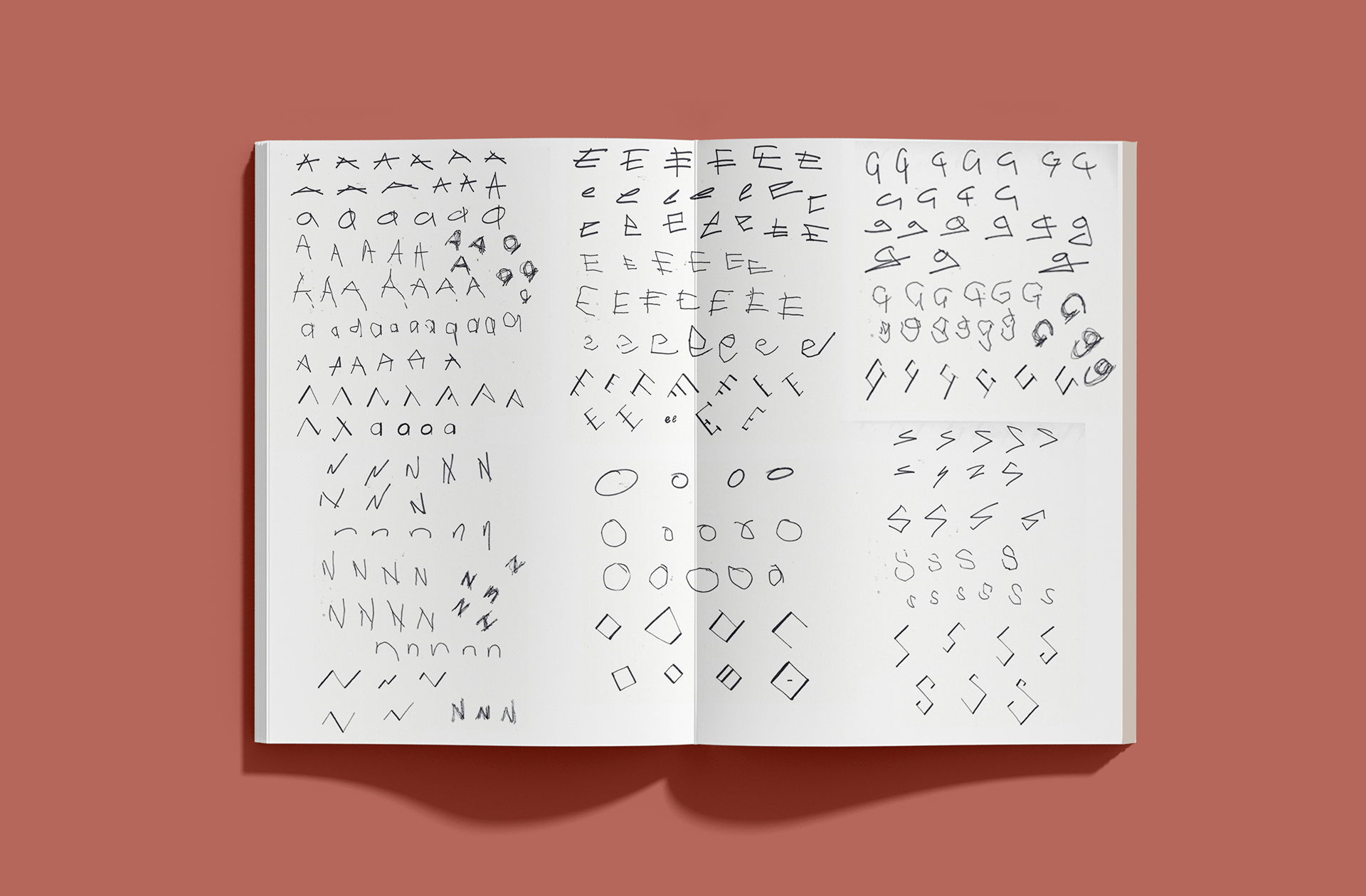
After expressing interest in a few different styles, the experimentation of specific letters was valued as more structure was able to be applied. Starting with ‘A,’ all letter experiments followed the same layout out. rough ‘A, E, G, N, O, S,’ I wanted to capture the eerie tension with quick strokes and loose structure. The grunge connotations were created through the irregular patterning and width of the experiments. Some lower case type was experimented on but furthered my approach to uppercase letters as the structure was better suited for the styles chosen.
This stage of development was quick and instinctual, which allowed me to generate many options and possible outcomes. My approach to this stage was to work on a macro scale to understand my options then start eliminating and work on a micro scale and flesh out working elements against the weaker ideas. I made sure I kept this work style when constructing all letters, as a specific style might work well with one letter but not another. But by having so many diverse options moving forward to start detailing specifics, allowed me to see the obvious aesthetics that work across all six letters.
Once analysing the letters as a whole, it came to my attention that the geometric angles and variance in stroke weight proved the most consistent approach across all letters. is idea was also reassured through class feedback and working within our group. The geometric forms had a clear structure, which is most important when creating a font.
Typefaces follow rules and forms to create consistency and legibility throughout a set of letters. All letter must follow the same rules and structures otherwise they would not belong in the same category. The other styles were still explored but was not favourable as the font was still in a handwriting phase, with little rules and measures applied. Moving forward it was suggested to take the set of letters and start constructing them on a larger staff, to gather more important details and forms of each letter.
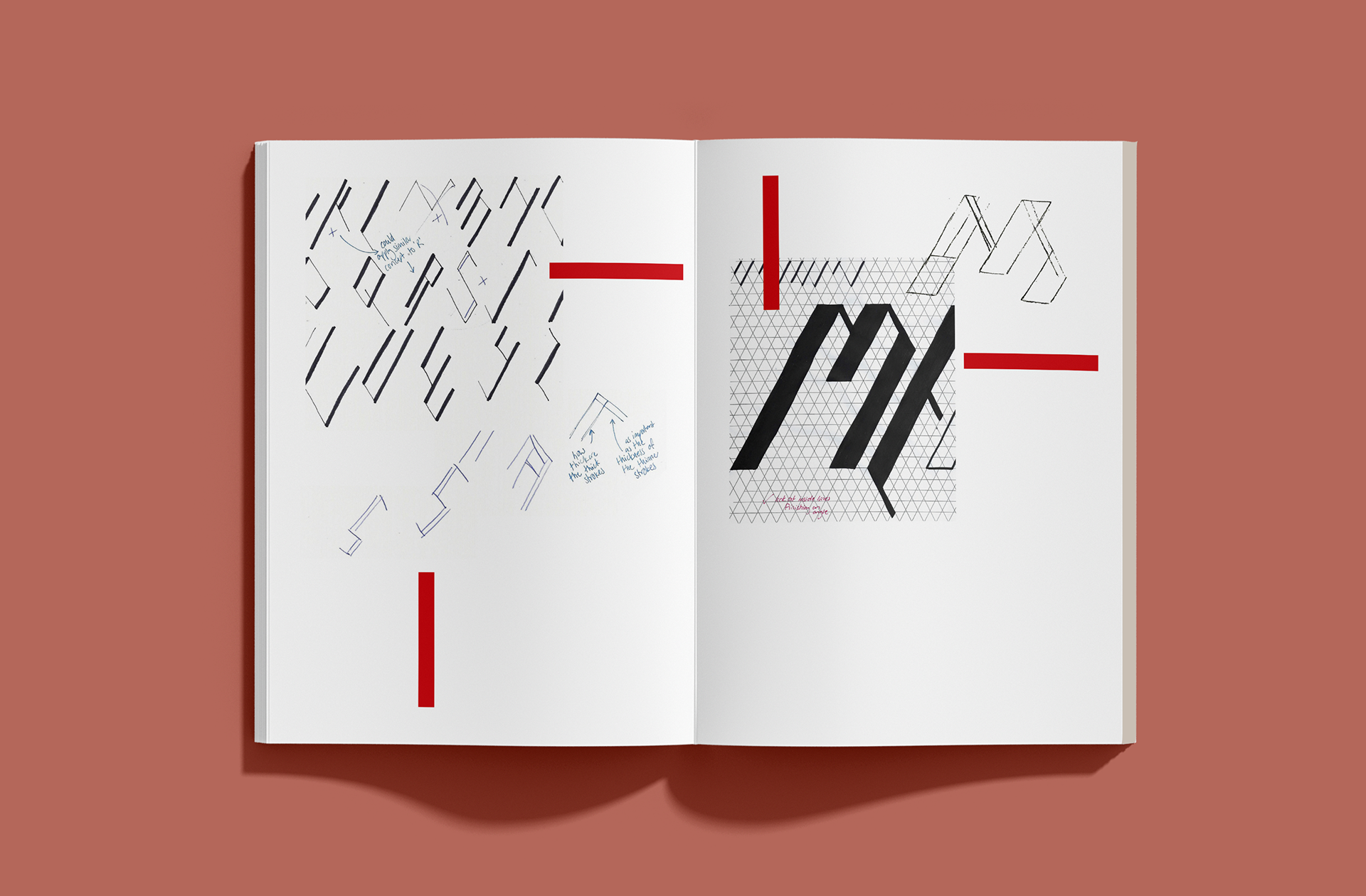
On the larger staff I explored each letter again but specifically targeting the angle of the stroke and the end points of its direction. It is seen that the letters have little restraint as the angles are contradicting each other and the thick to thin strokes also change across the same letter. On the larger scale the letters started to appear block like, which concerned me as the width would be unreadably long. I then decided to solve this issue with the form of layering the letters, at way the width can narrow in and the intertwining of elements would be interesting across a line of text.
Through experimenting this idea of from I noticed that the perpendicular intersections caused letters to change completely. Simply seen the set ‘AEGNOS’ reads ‘AEEVOS’ as the intersection of the ‘E’ adds an extra stroke to the other letters, ruling its legibility purpose. Because this idea was unsuccessful another solution was to create all letters angled in the same direction. This builds specific structure and restraint to the font, allowing myself to create rules to solve design problems. Further experiments were constructed to discover desired angle and direction of the letter finals. I then decided on which direction would be thick and which thin, but the angle of elevation was still to be developed.
Before next feedback session I wanted to create the alphabet to fully understand where my ideas were headed. e strokes and structures were finalised and completely open to feedback, as this presents a fresh and non subjective eye to evaluate the work. Overall the structure was strong, but held a few inconsistencies and weaker structures. is was spoken about and gave me a new perspective of my designs. I overall agreed that the reconstruction of a few letters were vital to the overall value of the font. It was then instructed that I move to a large scale mapping of each letter with intentions to create each stroke as a shape rather then a one lined stroke. is would allow me to decide how thick the thin strokes would be in comparison to the larger ones.
Final stages of development for digital reconstruction was the use of isometric grid paper. Tracing and drawing straight onto the grid allowed each angle to be the same and consistent through each letter and also allowed myself to calculate the thickness of each stroke, using shapes.
Firstly, simple tracing was experimented with, with no exact proportions in mind. Unfortunately this was unsuccessful as the letters created width and lost the slim falling structure of the handwritten letters. Deciding to mark directly onto the grid made the proportions between the thick and thin much more noticeable which increase my intent and purpose of each mark. A er calculations I decided that the thin strokes were a half a unit and the thick is two units, creating the promotion ratio 1:4. Once I was able to visually see the success of these calculations I moved to digitally rendering them in Adobe Illustrator with the pen tool. With this I created each individual shape, which overall created each letter.
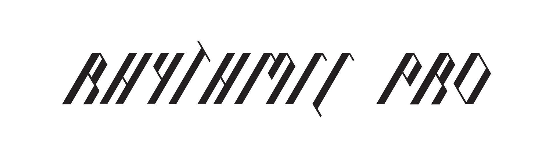
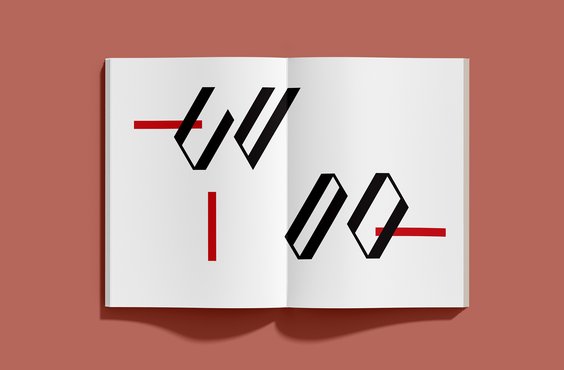
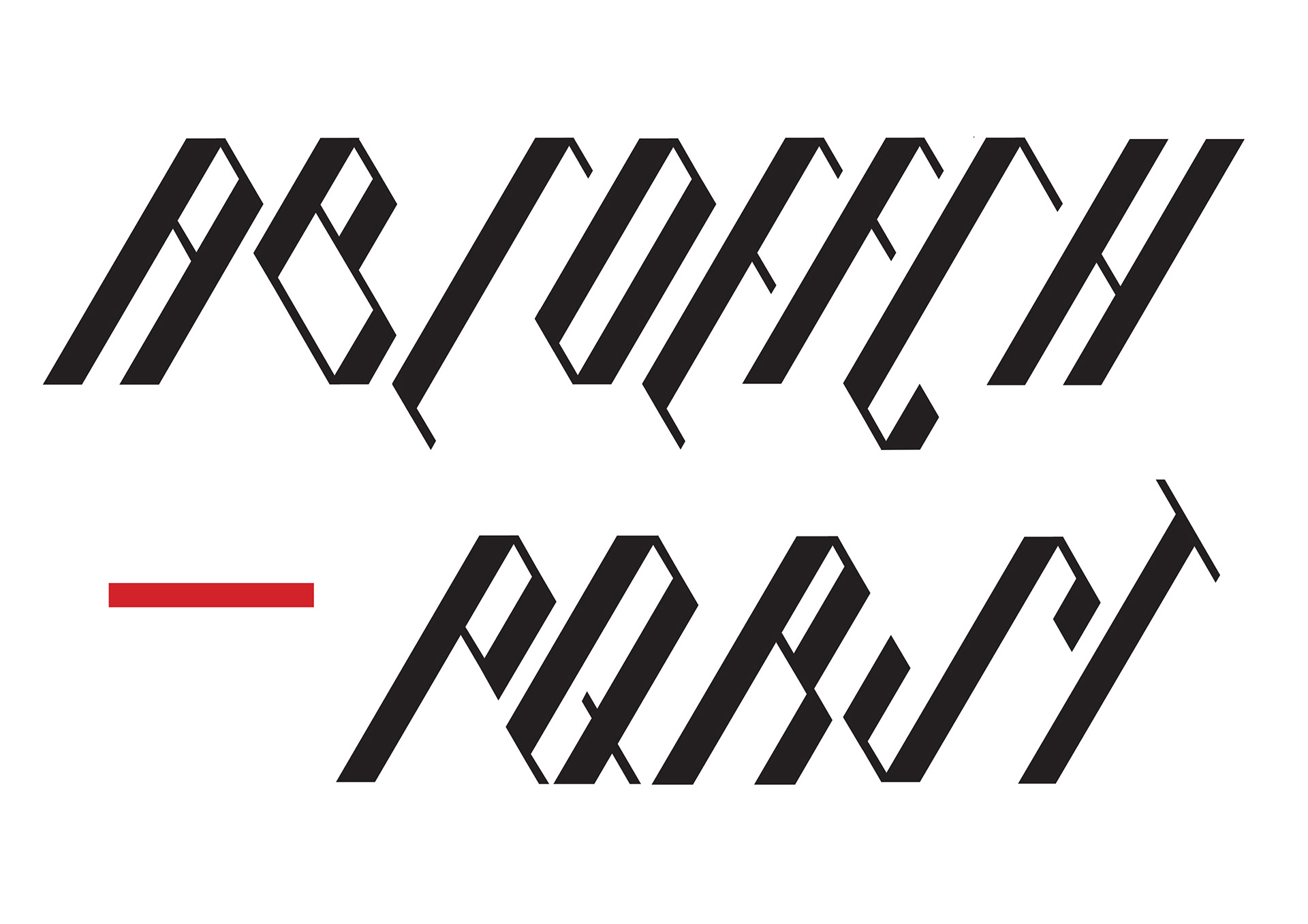
e font is sans-serif with angled terminals that come to a point at the end of each stroke. e thick strokes are presented when the angle is 60 degrees elevation, while the thin strokes are decided when the angle is 60 degree depression. The ratio between the weight of the strokes are constant across all letterforms being 1:4. For example, if the thin stroke is one unit then the thick stroke would be four units, and a thin half unit stroke would be accompanied by a thick two unit weighting.
Along the baseline all letters form a at horizontal terminal, with the additional outliers of the letter ‘V’. is was a strategic break in rule to distinguish that letter from its neighbour ‘U’. The downwards and upwards form of its basic structures made the letters identical in the development stage. Creating that point not only just distinguishes itself from its neighbour but also tells viewers its own identity. is is because we are conditioned to view the upper case ‘V’ as a pointed letter, with sharp connotations, similar to an arrow. Adding this feature connected the already set idea the audience would have by also challenging other ideas of letter forms.
Another distinguishing factor is the relationship between the ‘D’ and ‘O,’ as again have identical structures when deleting curves from its origins. The idea that disrupted its similar traits was referring back to the studied Gill Sans font previously. The difference between these letters in that style was the aperture of the letters. I found that the ‘D’ had a narrower aperture because of the straight edge to the left side. Applying aperture to the two letters I was able to distinguish the letters. ‘D’ in comparison to the ‘O’ is a lot thinner in aperture, therefore, combined with the context around the letter it would still be legible as one or the other.
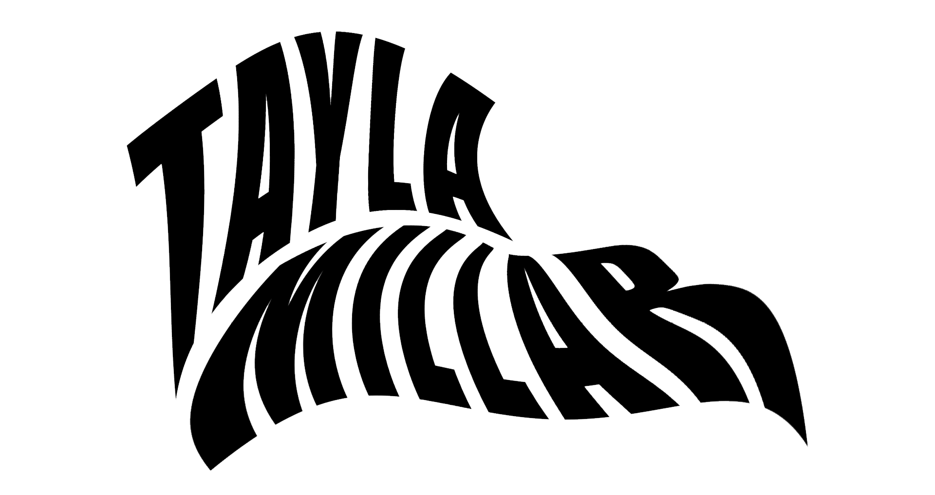
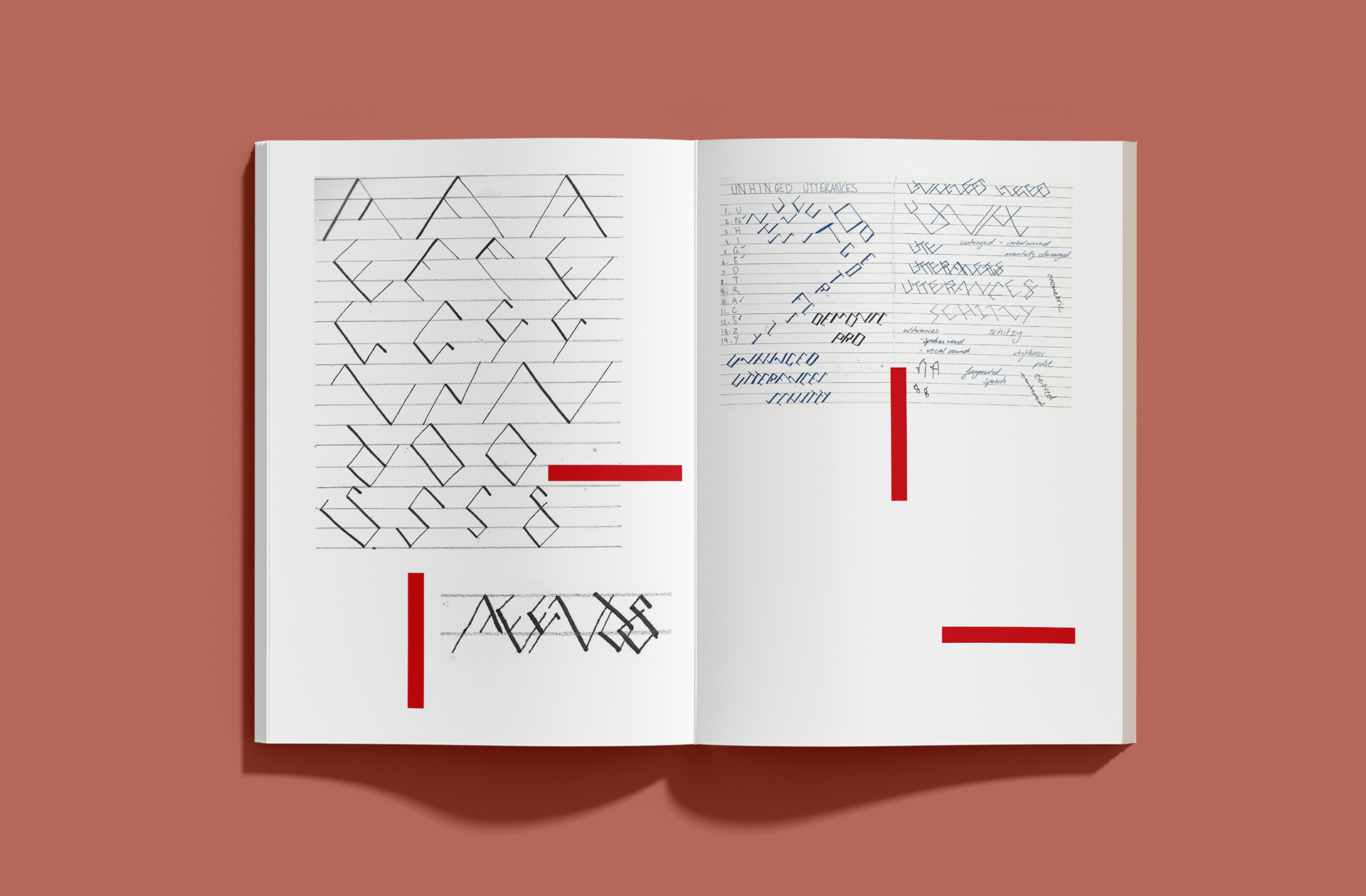
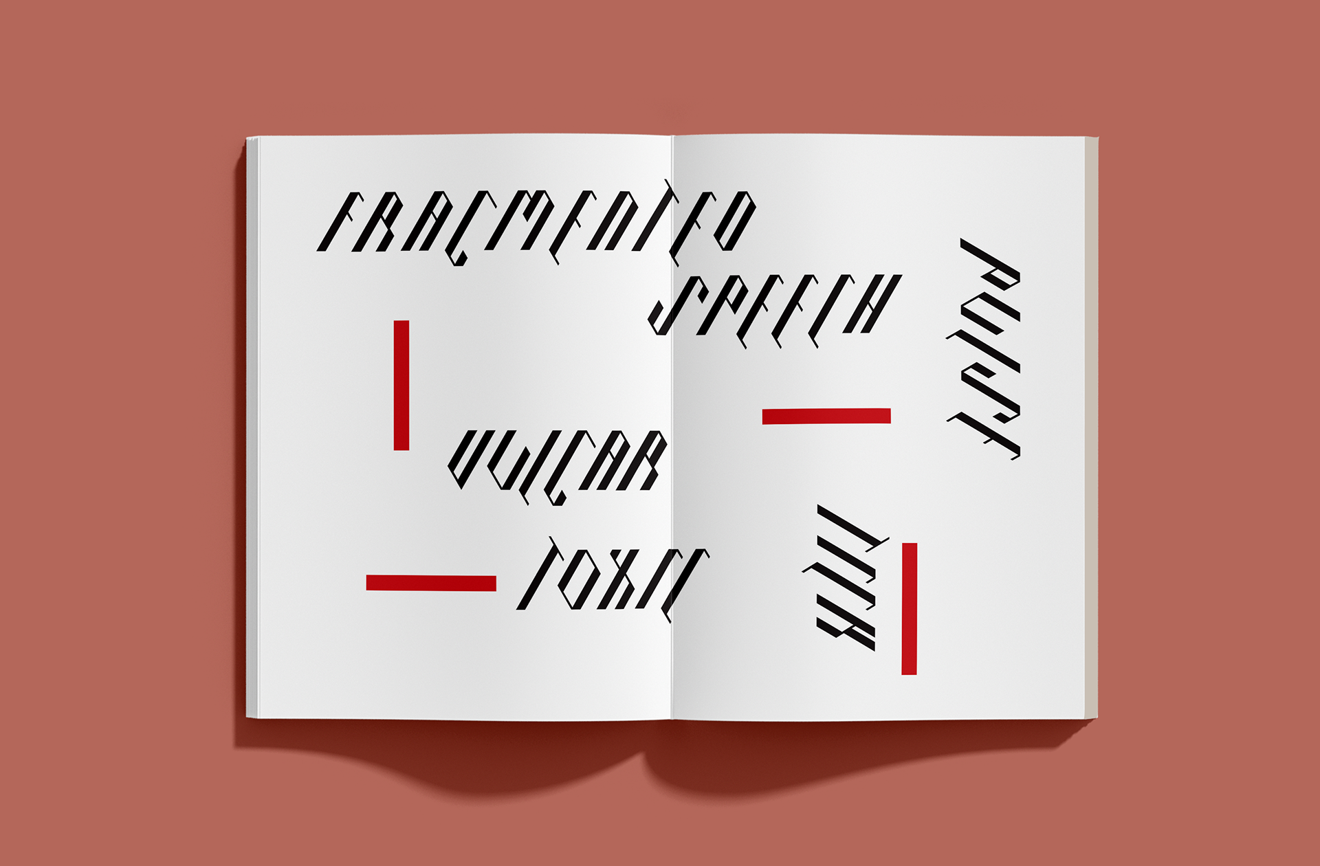
RHYTHMIC PRO ALPHABET
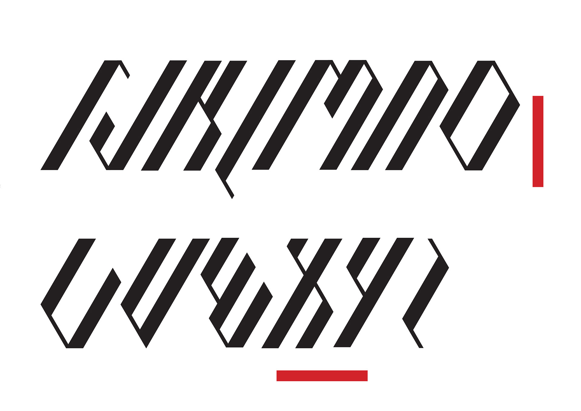
Words that showcase the font
The fragmented human experience we are conditioned to, has pushed us to believe what is and is not human literature and text. Rules and systems are implied subconsciously from a young age and that a ‘modern type’ was established in the 1920s. As a designer I forward my problem solving skills and use design thinking to approach a new concept or problem.
Rhythmic Pro is a set of repetitious lines that have no meaning other then the context we have implied to it. Our minds have grouped the intersections of lines together to create open and closed shapes to reveal specific messages. The custom typeface is designed with the particular job in mind and therefore will be useful for professional application. The typeface would be commissioned to express the conceptual brand and ideas for the specialised audience. The new and original typeface makes it easier for audiences to find the visual angle of the design and the custom typeface will imply the context to which the design is situated. The newly established font will create professional visual and well written presentations of outcomes. The relevant insights and arguments from the inspired research would be shown through once application becomes prevalent.
As designers we must also think in new and innovative directions rather then just creative measures. The conceptually formal contexts of the font will endure its longevity in modern design and will be extremely useful across many platforms and medias. Rather then adjusting or re-imagining given text from, our job was successful in designs a personal, hand custom design that was then digitally rendered for formal use in production. The level of professionalism was achieved and the font is now commercially marketable for use. As the designer is see the design from a viewer perspective looking at the outcomes. During the process development, a full set of twenty-six characters was achieved and rendered, creating a complete typeface for mass production.
Considering form and structure allowed the characters to build a balance of individuality as well as consistency through the set.